'Agla Sans follows on from my typeface 'Incorporeus', which was designed to represent a fictional language. This meant that that its uses were ultimately limited to the literary universe that it belonged to.
While named after one of my fictional characters, 'Agla Sans' is not dependant on them for its functionality. The 'Sans' part of the name naturally comes from the typeface being sans-serif, though some elements are close to the border between serif and sans-serif. (Agla can be seen in my Behance project, 'Agla's Art': https://www.behance.net/gallery/104754485/Aglas-Art.
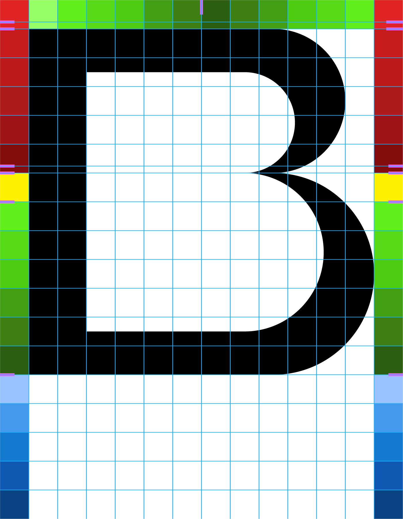
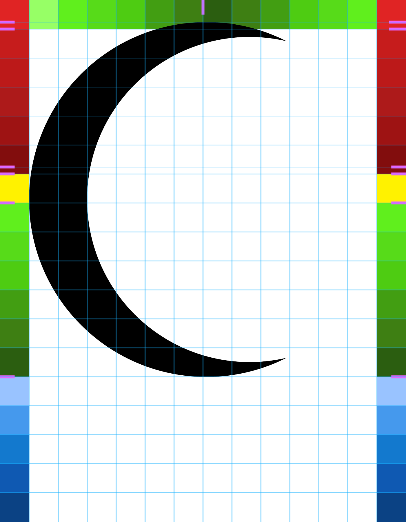
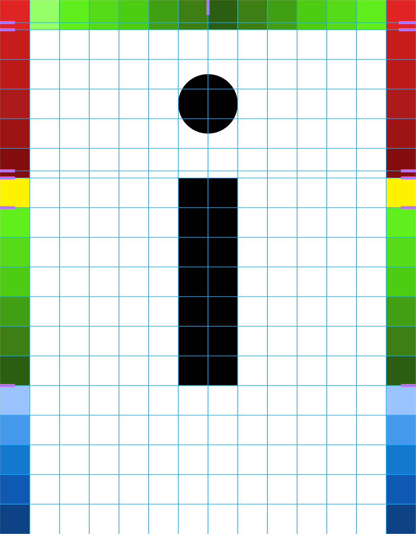
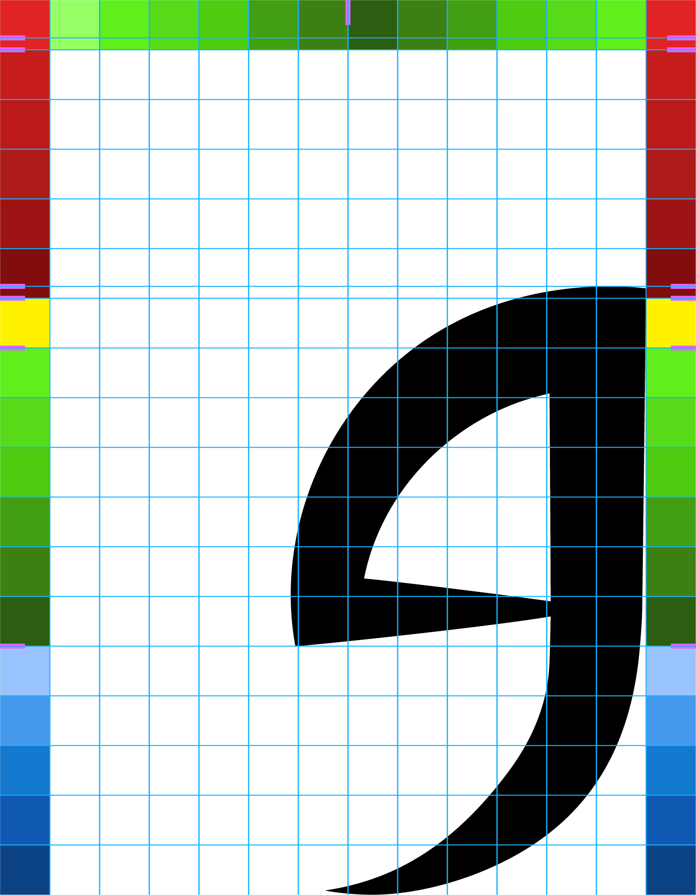
The following four images show the guides I used to ensure consistency in character proportions. Guidelines form a grid in which each square is 10x10px, though glyphs were scaled down to 50% before exporting to Birdfont. The red colours represent the upper portion usually filled by uppercase letters or some punctuation. Yellow is the immediate area below the centre point. The vertical green areas represent the lower portion, in which the bulk of lowercase letters are found. Finally, the blue area represents where descenders are located. Some glyphs extend into these colour areas for various reasons, such as if they have curved edges.
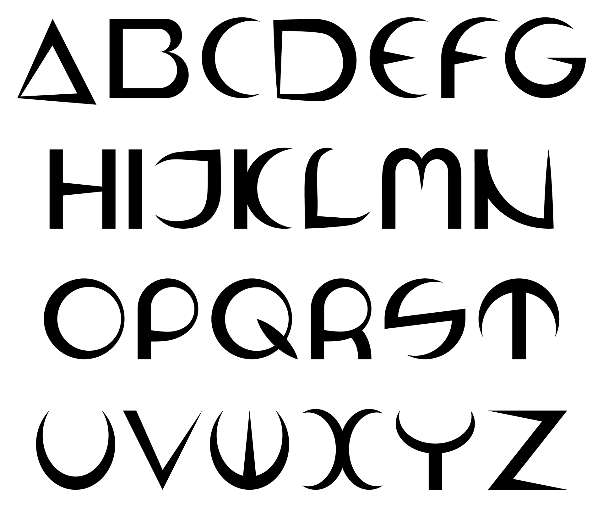
An example of this is uppercase 'B', which fills the 12x12 square grid and the outside of the curves also fall on these regularly spaced guides.
Example of uppercase letter that does not extend into border colours.
Glyphs that reach a curve at the top, such as uppercase 'C', are taller by 2.52px to give the illusion to the naked eye that that they are the same height as flat-topped glyphs when viewed in sequence.
Example of uppercase letters with a curved top.
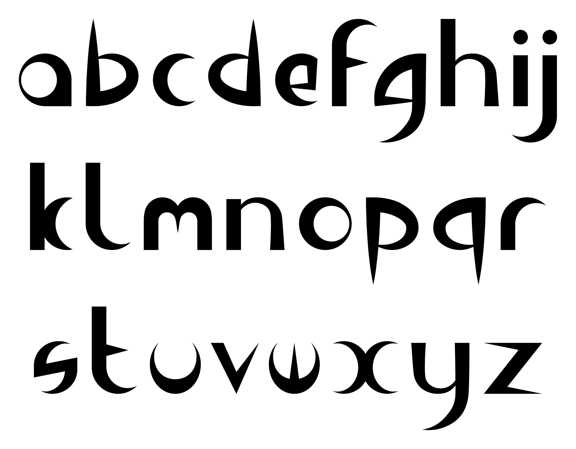
Flat-topped lowercase letters or exceptions, such as 'i', make use of the midpoint guideline as the basis for their height (minus the dot).
Example of lowercase letter.
Lowercase letters with curved tops make use of a guideline 2.52px above the midpoint guide in a similar manner to uppercase letter creation.
In addition, glyphs that have descenders, such lowercase 'g', hang below the baseline.
Example of lowercase letter with descender.
Presenting the uppercase letters together like in the image below demonstrates how they compare proportionally, not just height-wise, but also width-wise. For example, 'C' is clearly thinner than the 'B' and 'D' on either side of it. Letters such as 'U' and 'W' are the same width because they contain the same basic structure.
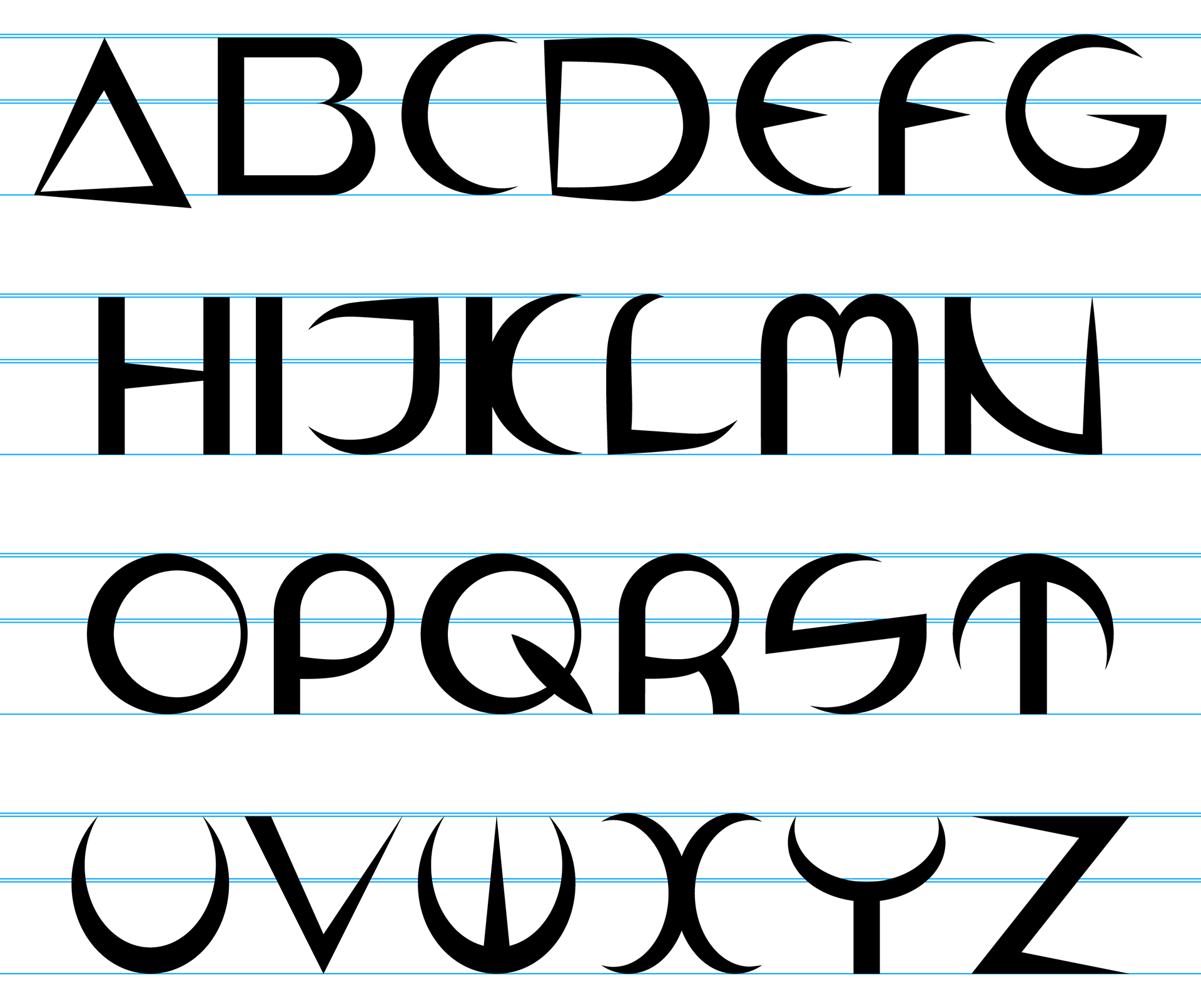
Uppercase with visible lines marking baseline, x-height, top and where curves rise slightly above the previous two
Although the lowercase letters appear thicker than their uppercase counterparts, the thickest part of most of the letters is actually the same as the uppercase and the illusion is a result of the uppercase being more 'stretched out'.
Most letters are only as tall as one of the two midpoint lines (depending on if they have a flat or curved top). However, some extend to the same height as the uppercase, such as 'b' and 'f'. Meanwhile, some descend below the baseline, such as 'g' and 'y', which few of the uppercase do.
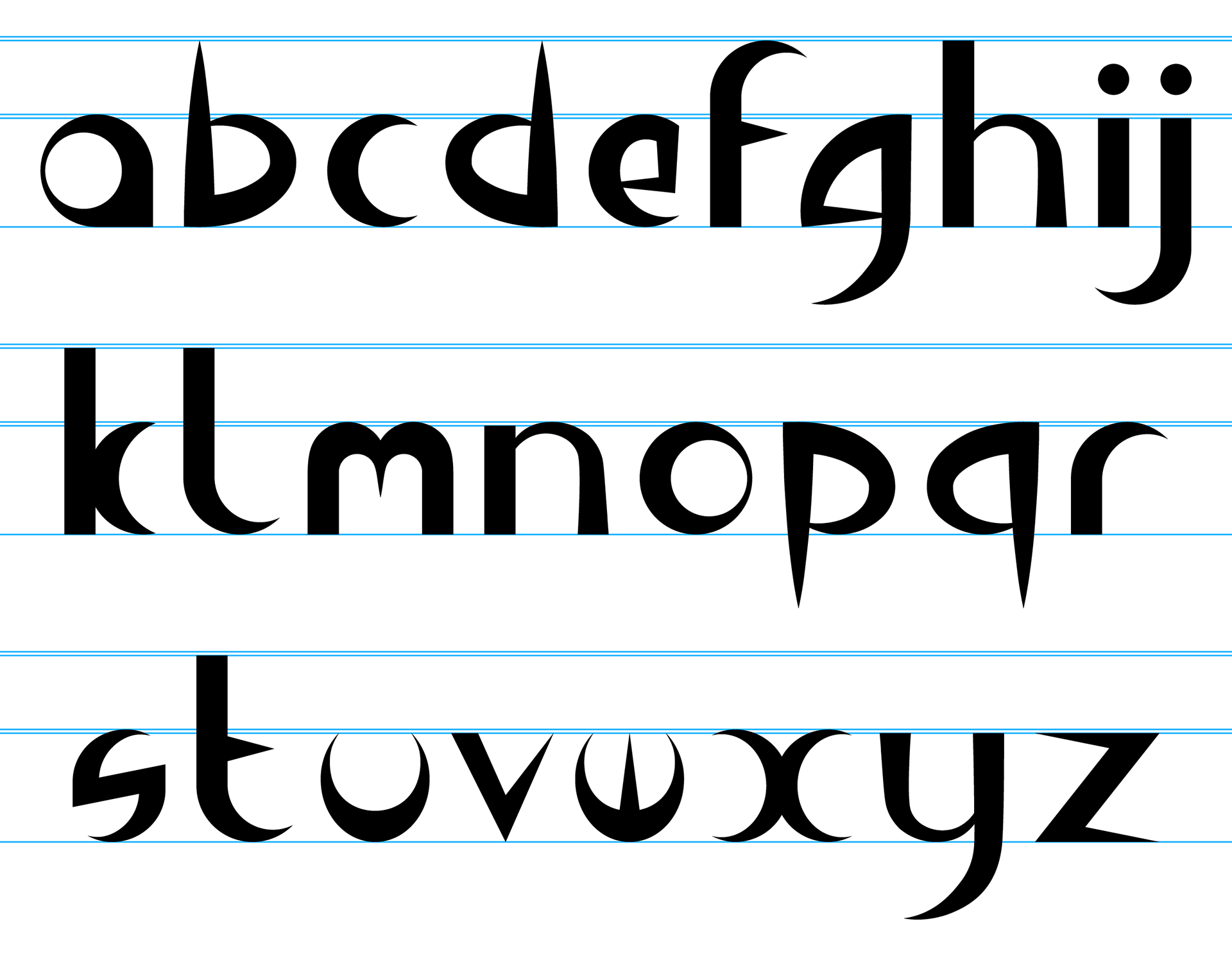
Lowercase with visible lines marking baseline, x-height, top and where curves rise slightly above the previous two (note that x-height does not match 'x', but better lines up with 'z')
The numbers generally distinguish themselves by being akin to thin/squashed uppercase letters; this is most noticeable with '0' when compared to 'o' and 'O'. In addition, '3' is similar to 'E', albeit the central arm is raised slightly and the entire glyph is flipped horizontally
'9' was initially the same as '6', albeit rotated 180 degrees, as is the case with many other typefaces. However, I was not satisfied with the results and '9' was altered to feature a more squared off appearance.
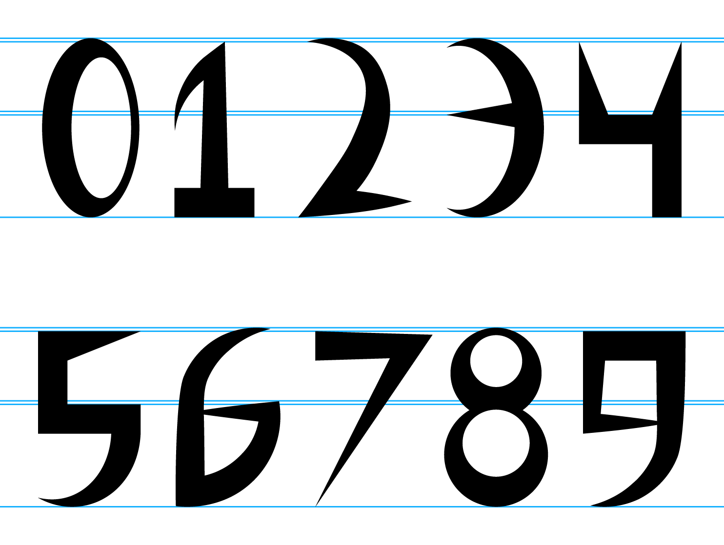
Numbers with visible lines marking baseline, x-height, top and where curves rise slightly above the previous two
Naturally, not every single punctuation character could be covered. For starters, I looked down at my keyboard to gather the bulk of the punctuation required. Then, I had to consider variations word processors create in context, such as left and right speech marks. In addition, as well as 'hyphens', there were also spaces for 'em dash' and 'en dash', all of which I filled with the same glyph. Although I did not want them to vary visually, I wanted them all to function within the word processor (leaving them blank would make them nonfunctional). There are many different currency symbols, but I focused on the main three from my perspective: Pound Sterling, Euro, and Dollar.
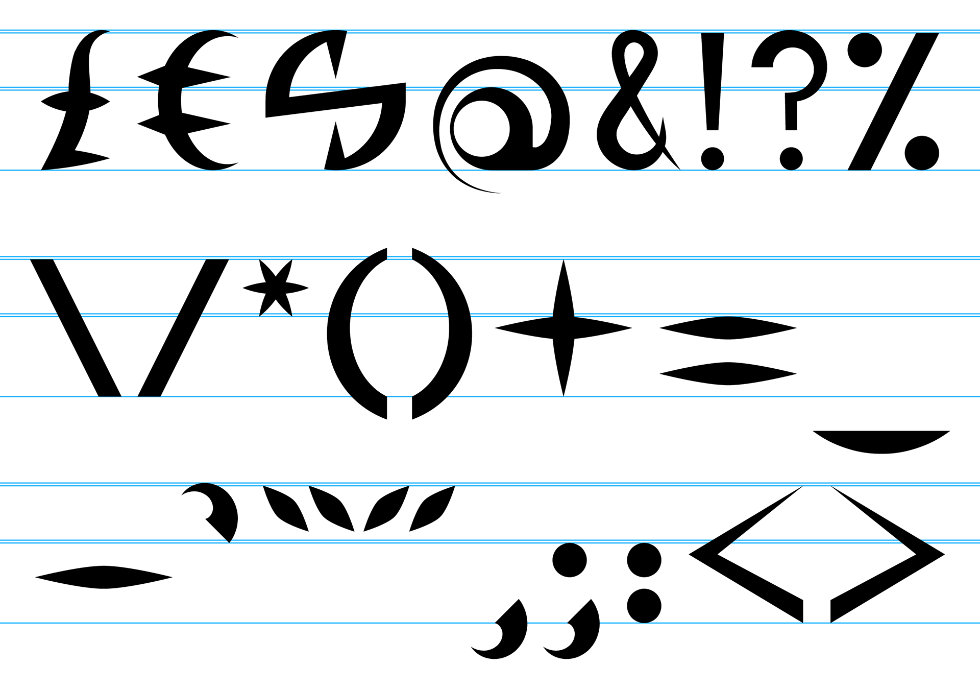
Punctuation with visible lines marking baseline, x-height, top and where curves rise slightly above the previous two
The following images are the entire typeface without guidelines giving a better impression of how Agla Sans looks when in use.
Uppercase without guidelines
Lowercase without guidelines
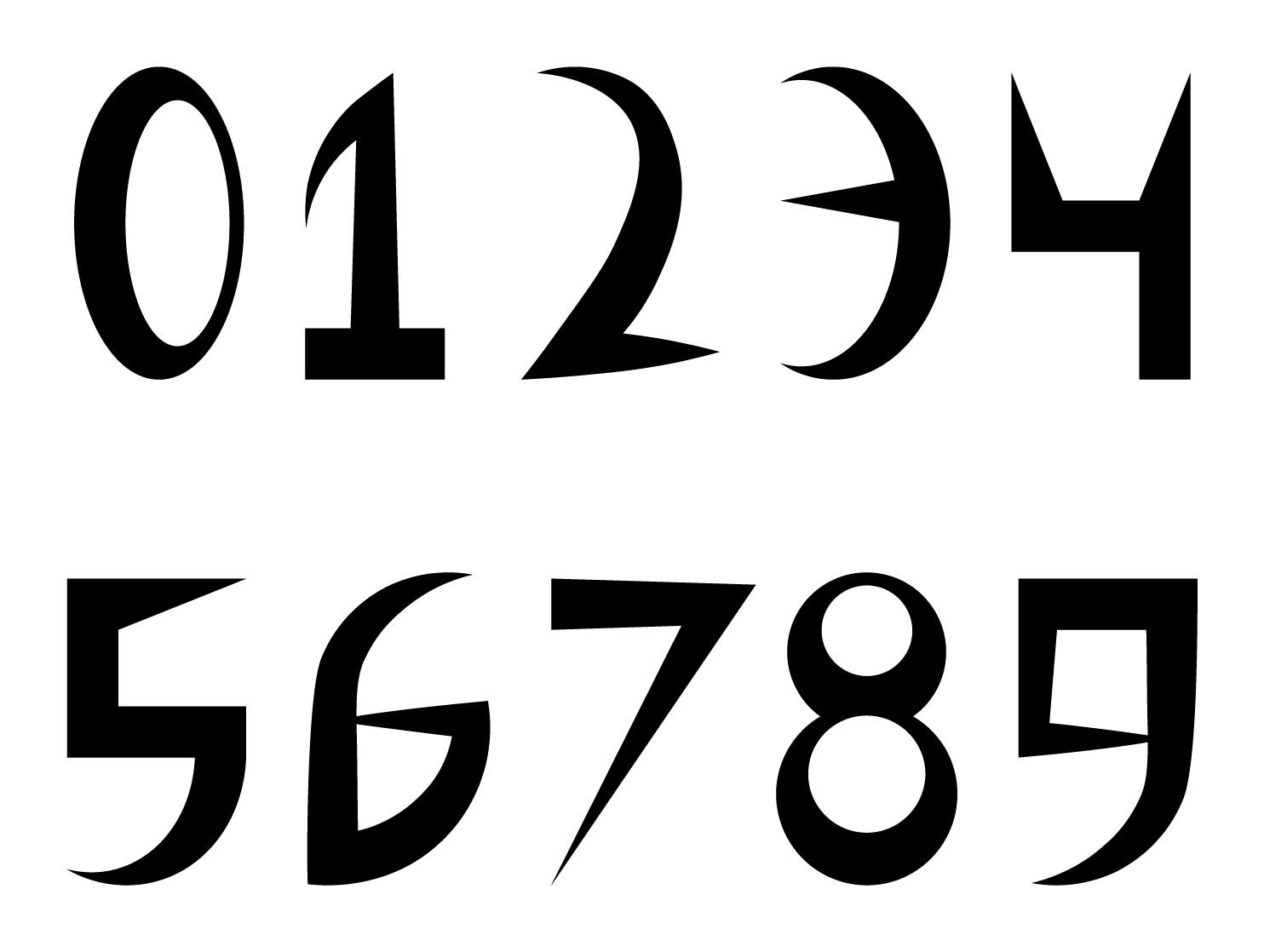
Numbers without guidelines
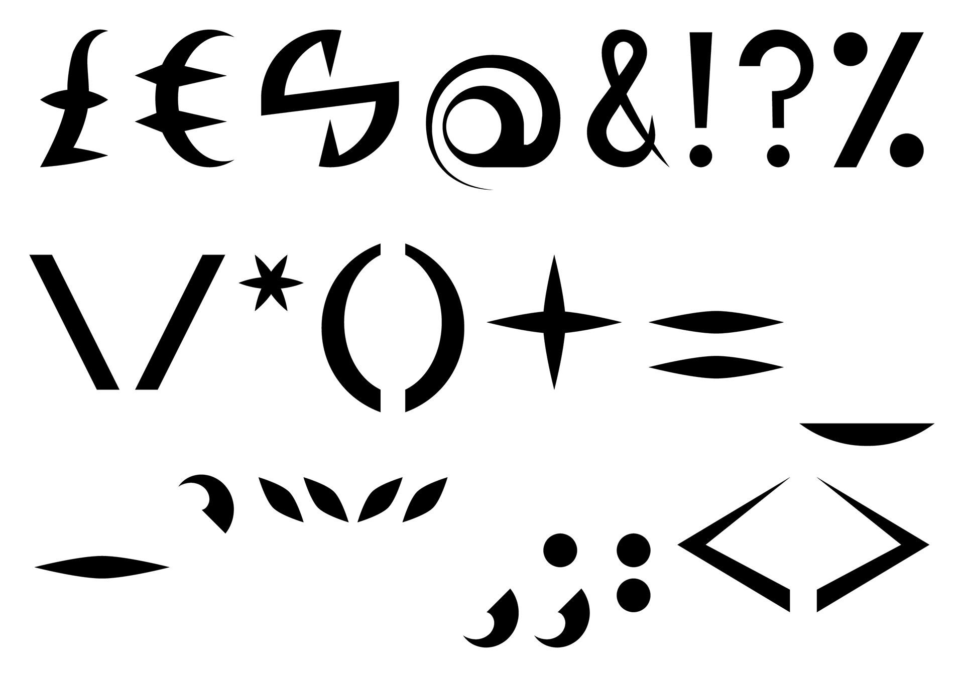
Punctuation without guidelines
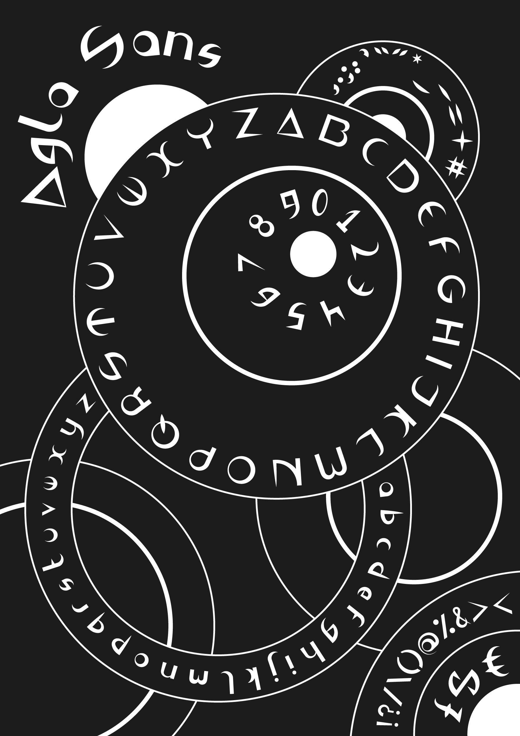
The poster below showcases 'Agla Sans' in its entirety through an eye-catching design that reflects the curved strokes prevalent throughout the typeface.