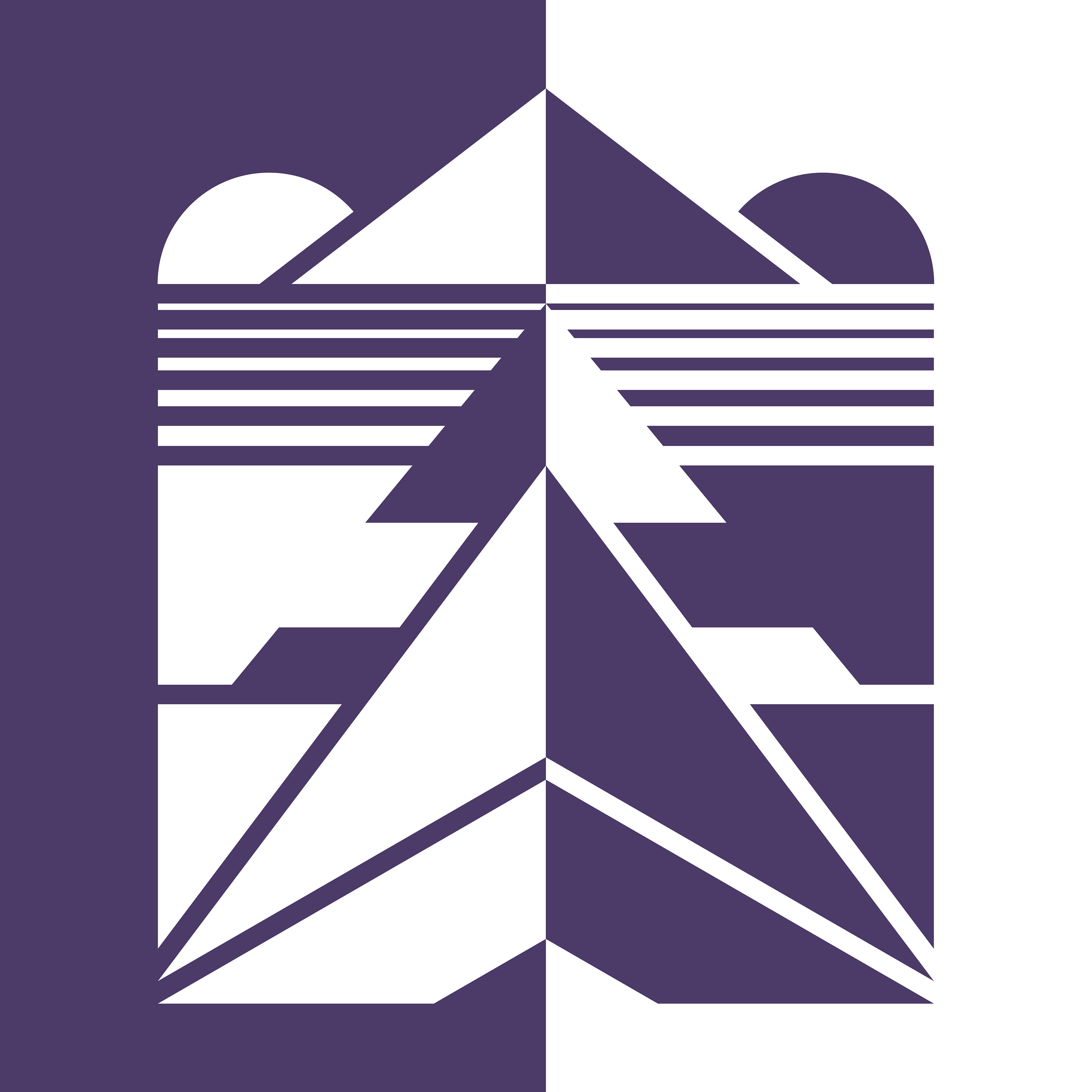
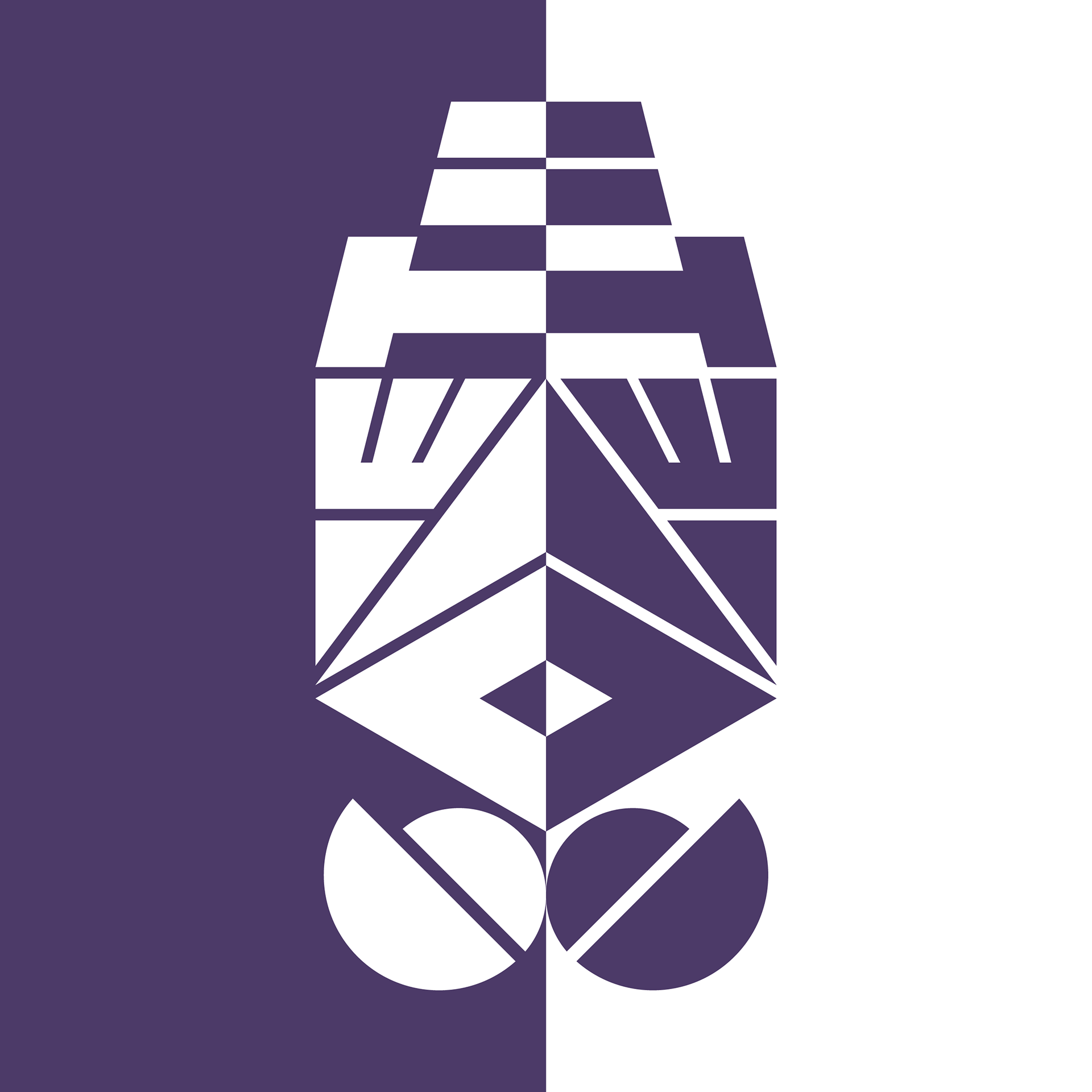
Below is the book cover design for my novel, ‘Agla’s Art’, which features bold, abstract typography, custom-made for the cover.
The typeface was never intended to be clearly legible, instead having a greater focus on aesthetics, hence the repetition of the titles in a clearer typeface below.
Besides the halo (Agla is an angel), there is little direct reference to the story, instead drawing parallels to her in-story art style, which is similarly abstract and geometric focused.
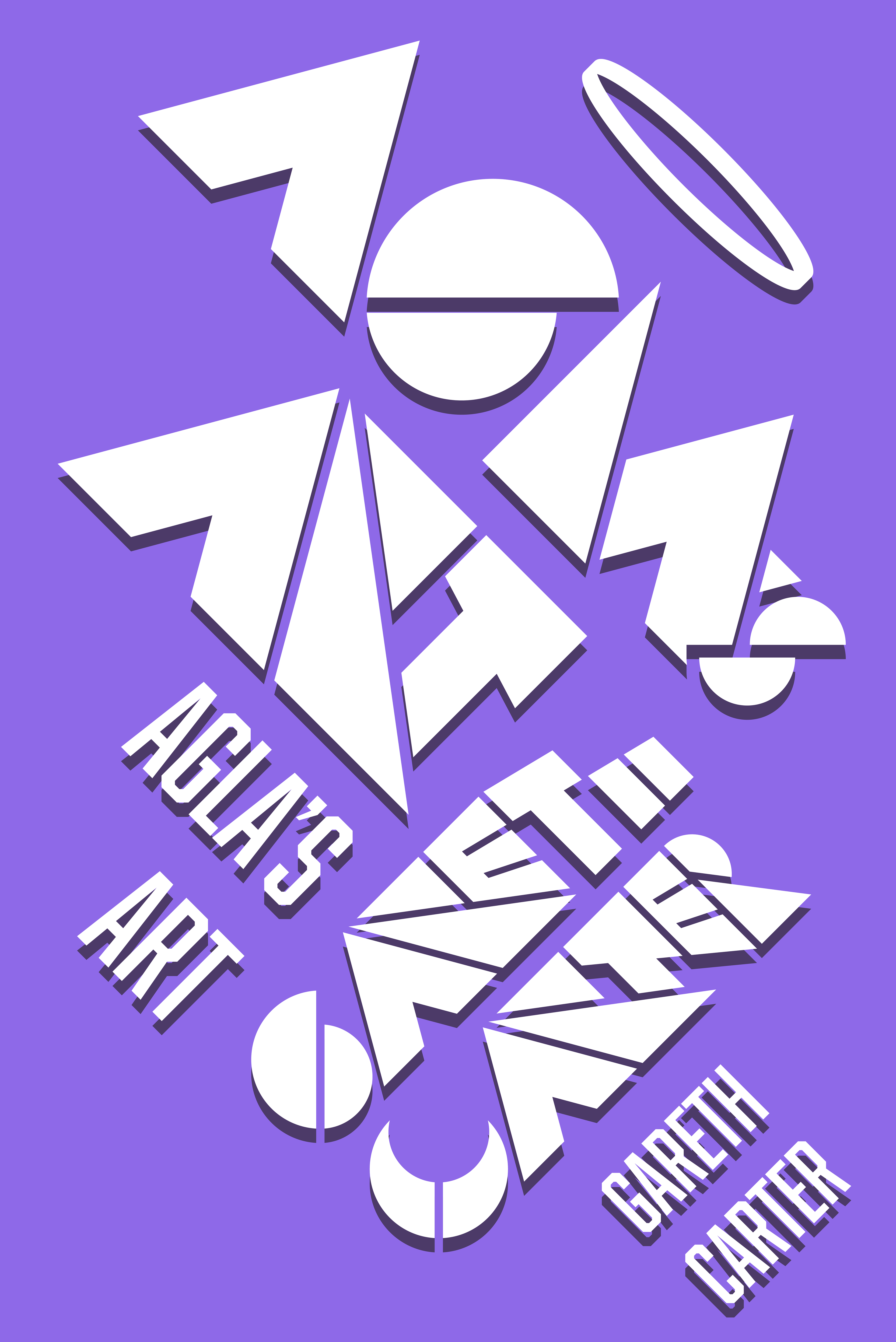
Not one to waste a new style, I continued to experiment with the lettering, creating designs for letters not included on the cover. This led to me rotating the name 'AGLA', flipping and casting it in two starkly different colours to create new abstract compositions even further removed from the letters they were formed from.
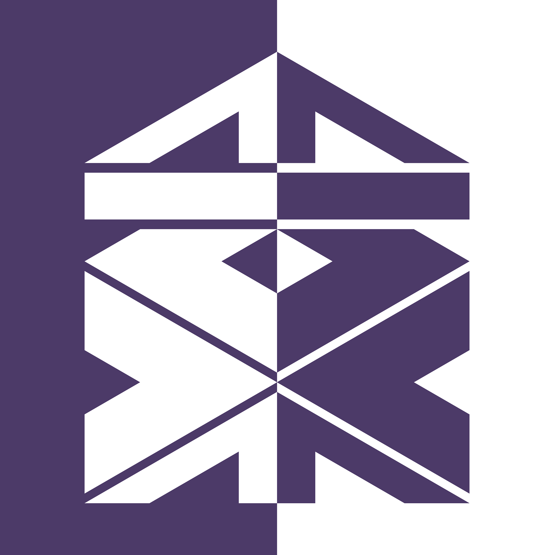
The natural follow-up design involved the second part of the novel title, 'ART', which resulted in a squarer, simpler and more focused composition.

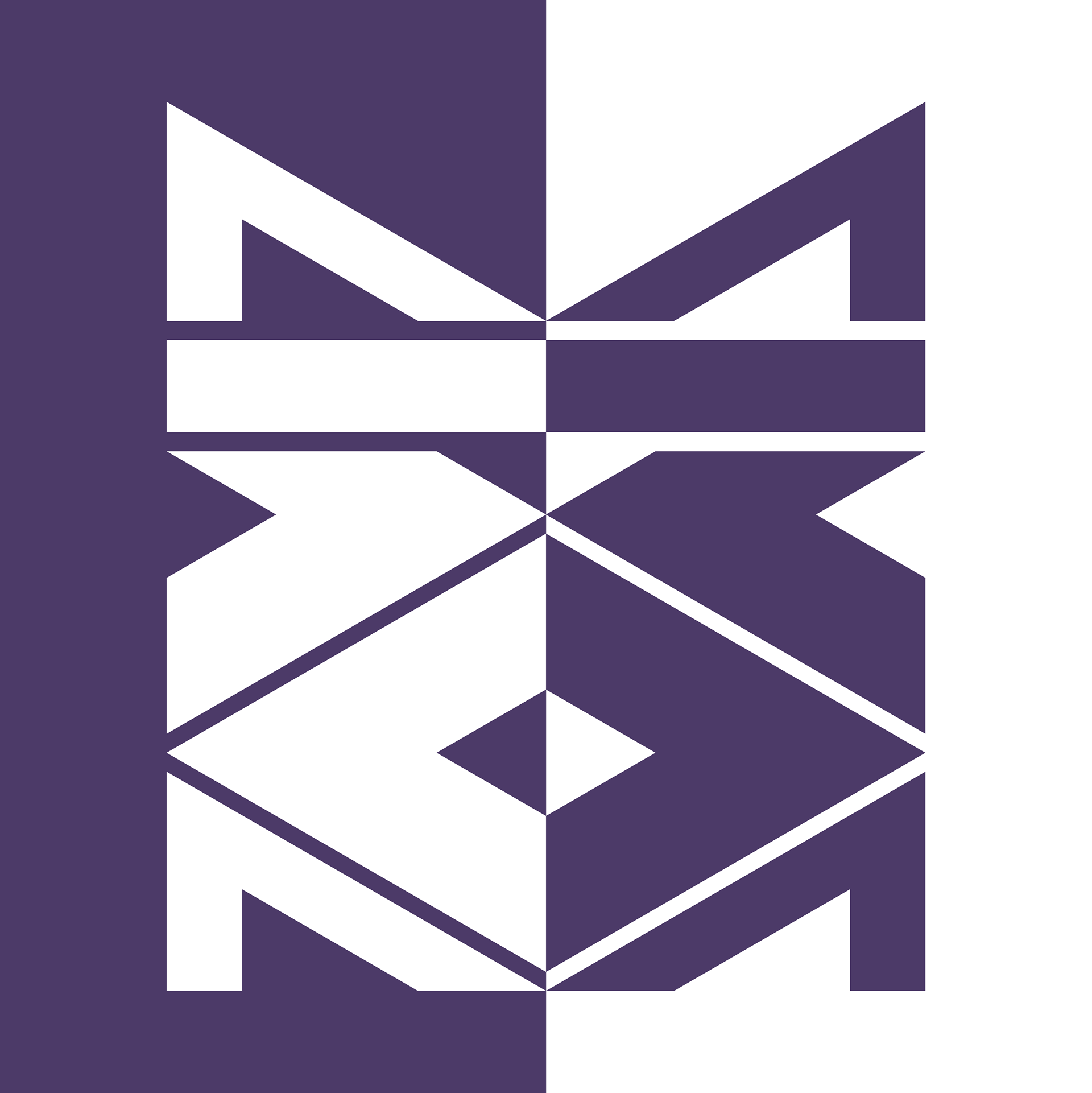
My name was the next to be included. 'GARETH' works okay, but the letter 'H' is not up to the level of more well-realised letters such as the 'G', 'A' and 'R'.
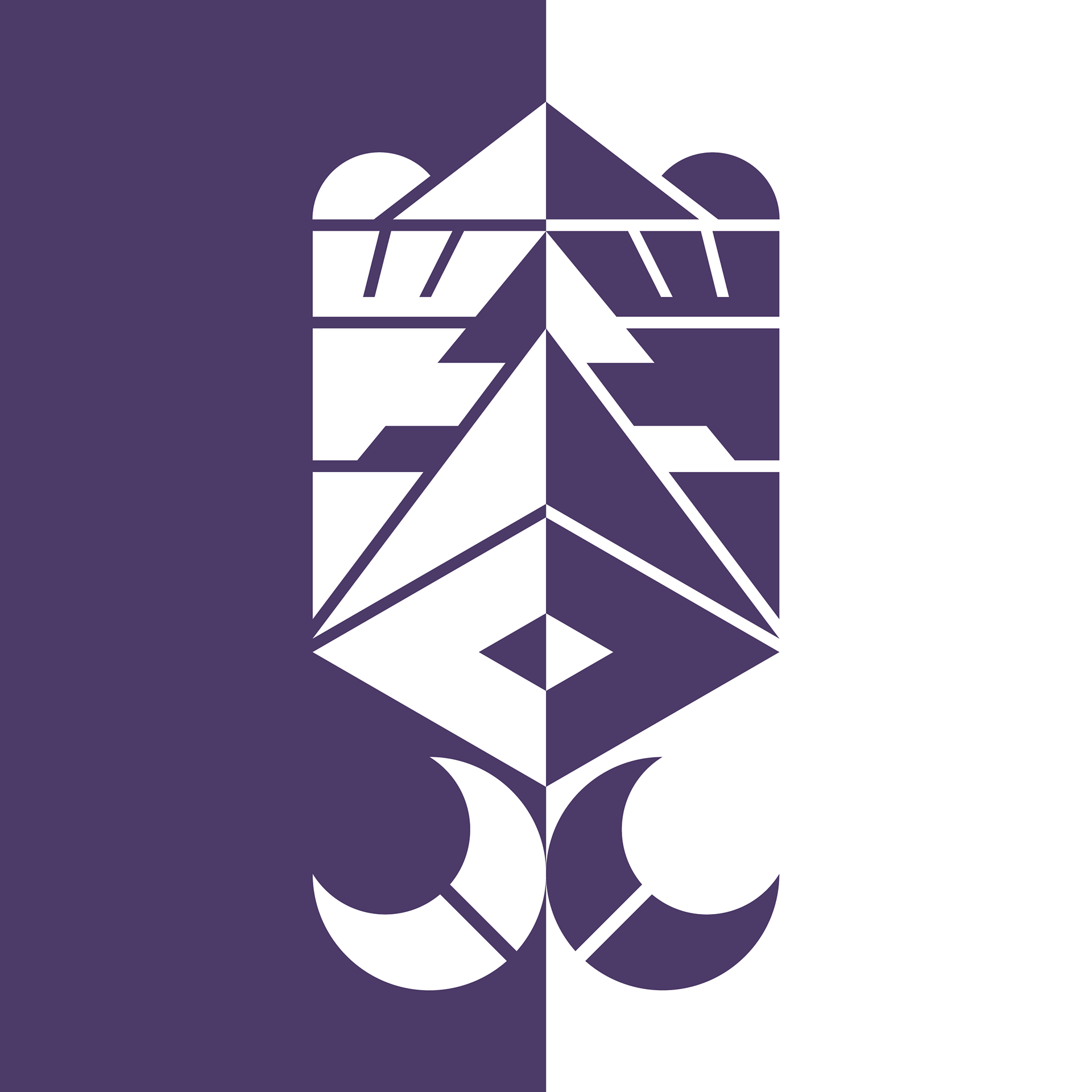
'CARTER' works better than 'GARETH', in part due to its more rectangular shape as well as multiple letters forming pyramids to create a recurring theme to the composition. Additionally, 'C' works better than 'G' due to its more identifiable crescent shape, which could make it resemble a moon to contrast with the rising suns on either side of the pyramid at the top.
The first explorations that did not feature the lettering from the original book cover design were the following two, which feature the name 'DAVID' as part of an exploration of possibly using these designs for personalisation possibilities. The only difference between the two is how the name is orientated, resulting in different mirroring effects.
Unfortunately, these particular designs don't work as well as the previous ones, though are by no means failures.
Finally, this was altered from elements of the others to be a more generic composition removed from any words. Playing on the pyramid interpretation of my 'CARTER' design, I included gradually thinning parallel lines to simulate distance on a flat plain in front of the furthest pyramid.