Collecting and listening to music, especially on CD & Vinyl, is an enjoyable hobby of mine, and a part of it is an appreciation of the wide variety of art styles that grace the many album covers that exist.
This series involves reimagining the album covers using a mixture of the title, music and original artwork for inspiration. Subjects are chosen from my collection or suggestions from fans and usually has an interesting title that could be interpreted several ways.
Below are just a few highlights from the series, but all of them are posted on my Instagram (click here to check it out)
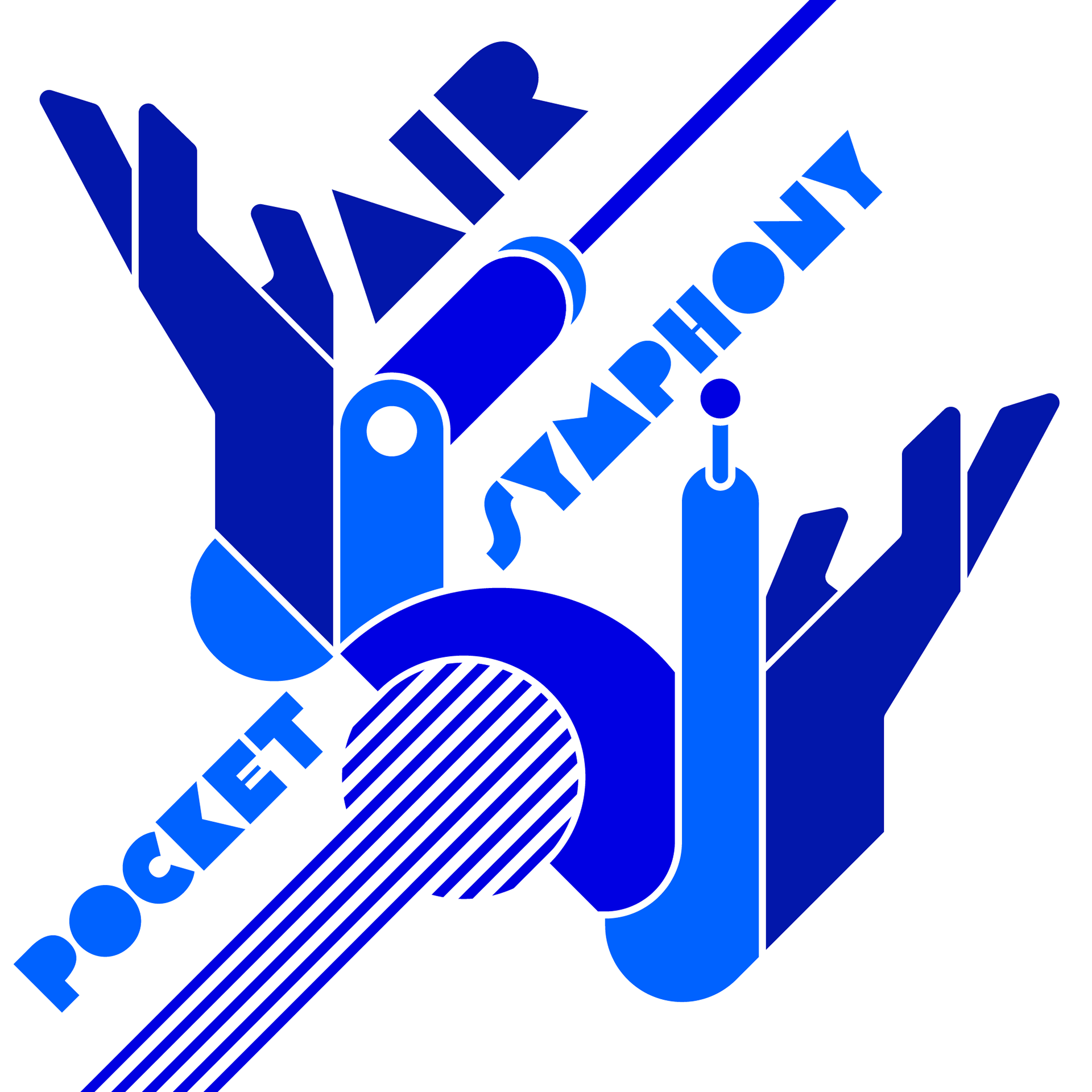
Air - Pocket Symphony
The starting point was the album title, which I reinterpretated to refer to a pocket radio. The smooth-edged, vibrant style I employed for the main subject was inspired by Air's oft bright and relaxing music.
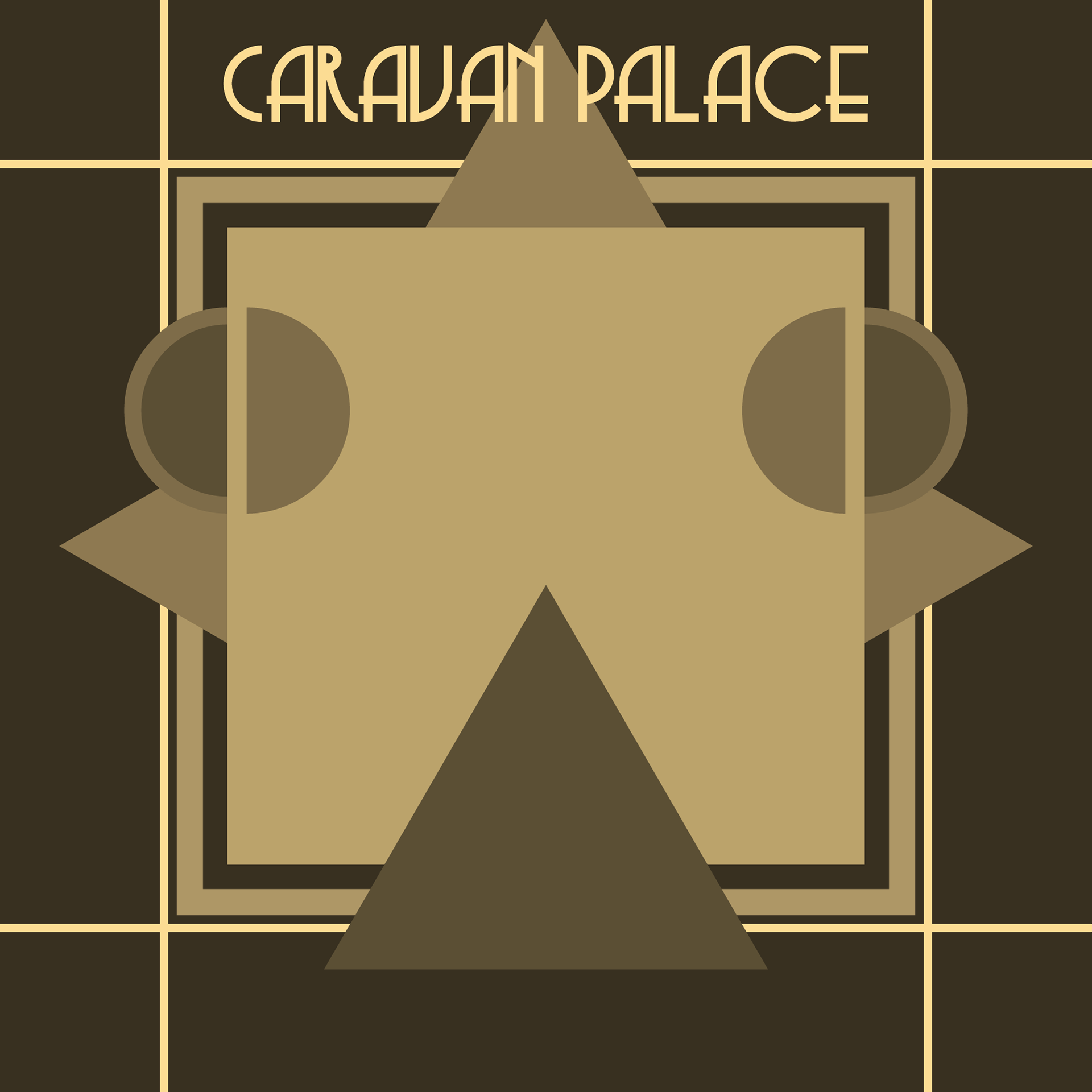
Caravan Palace - <|°_°|> (Robot Face)
The colour palette and general style of this design was inspired by Art Deco, an appropriate theme for an electro swing artist. The titulat robot is the band's mascot and a logical choice for representation here.
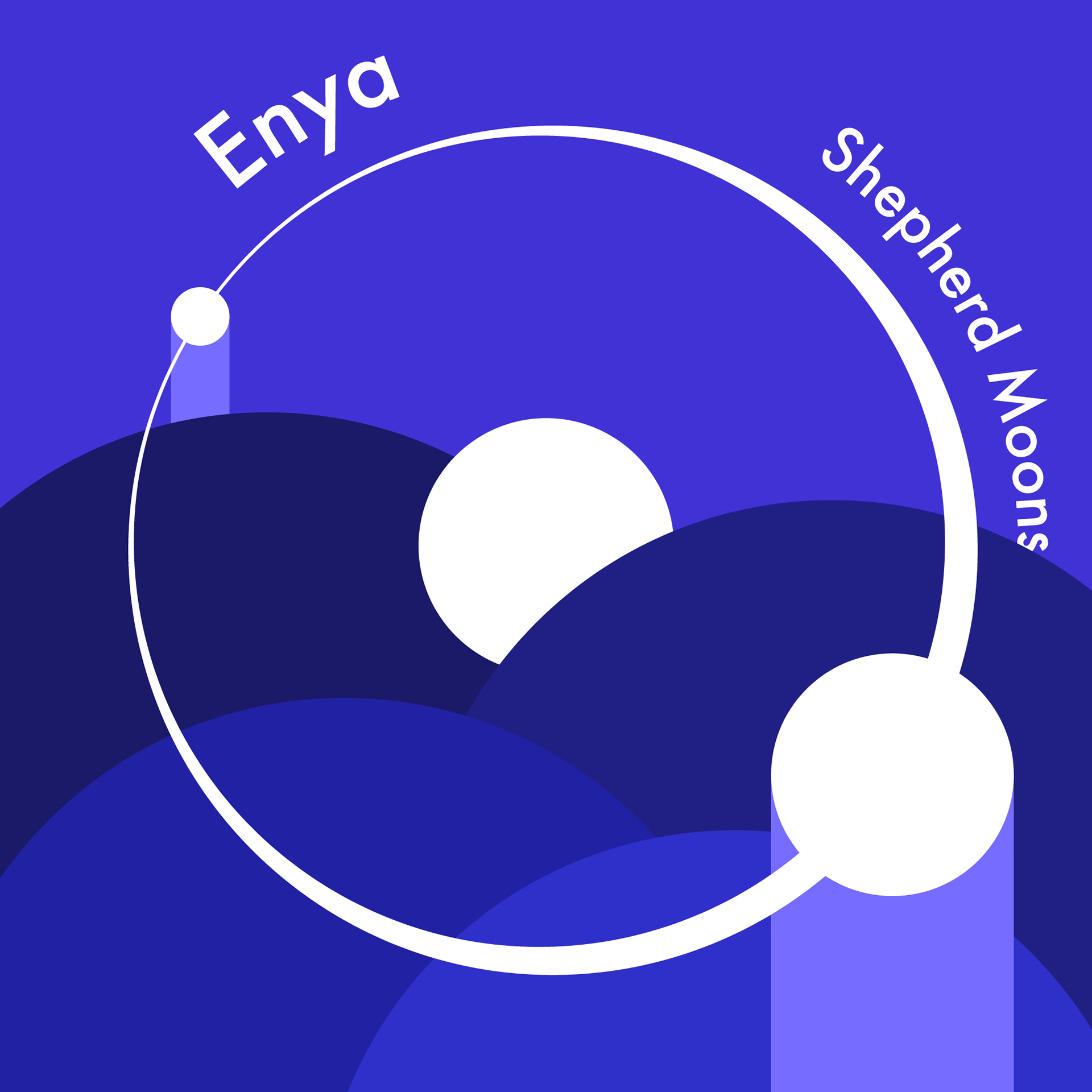
Enya - Shepherd Moons
A 'shepherd moon' is a natural satellite that keeps the contents of a planetary ring contained (in other words, shepherding them); this concept was depicted in this design. The colour pallete drew inspiration from the original album art.
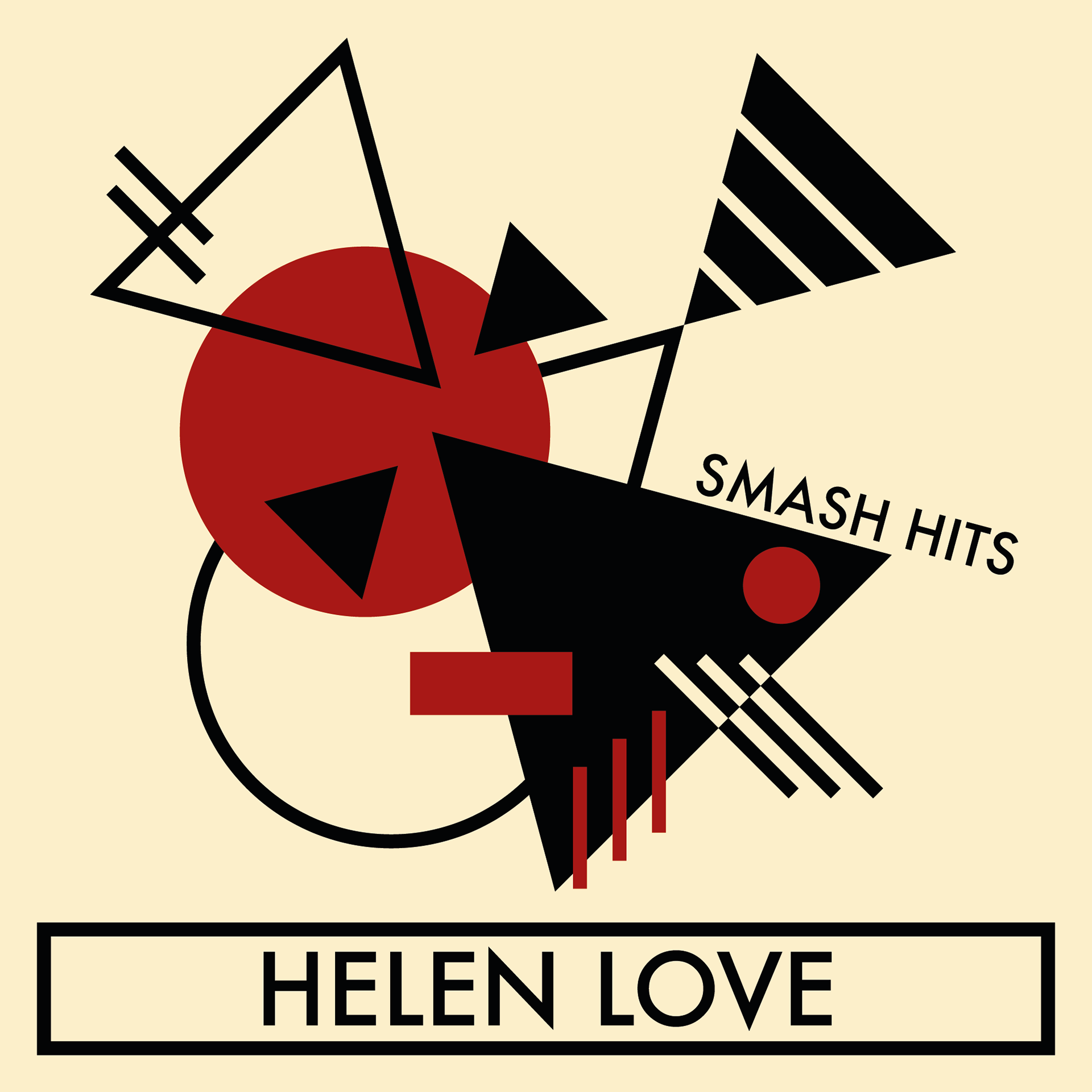
Helen Love - Smash Hits
With this design, I took the album title literally and created a composition of geometric shapes colliding. Additional inspiration for composition as well as the colour palette was drawn from El Lissitzky's 'Beat The White with the Red Wedge'.
Original artwork: click here
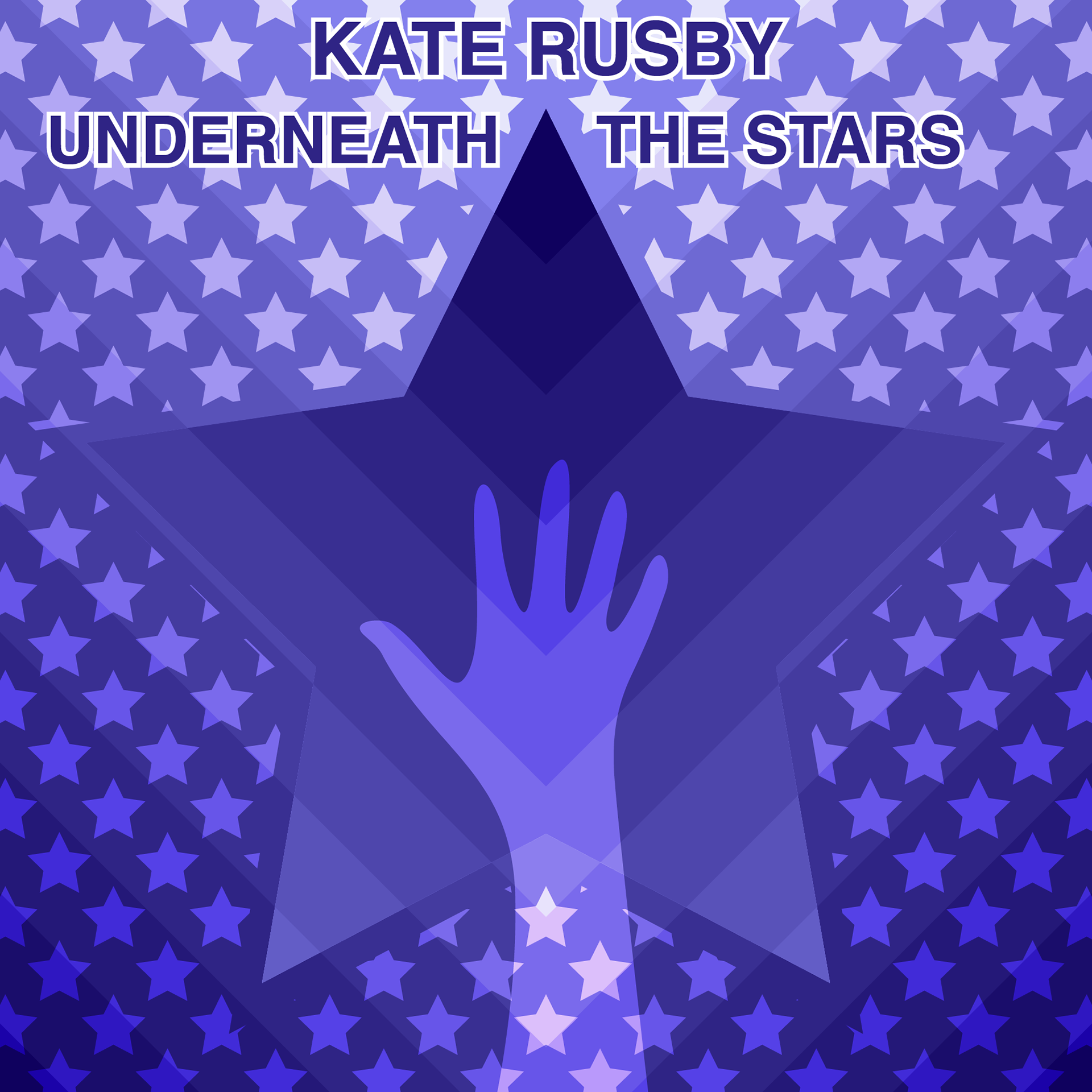
Kate Rusby - Underneath The Stars
Especially inspired by the title track, the design's composition and colour palette were intended to convey a calming, dream-like atmosphere. In the centre, an ethereal hand reaches out towards a star shaped portal, adding to the effect.
Original artwork: click here
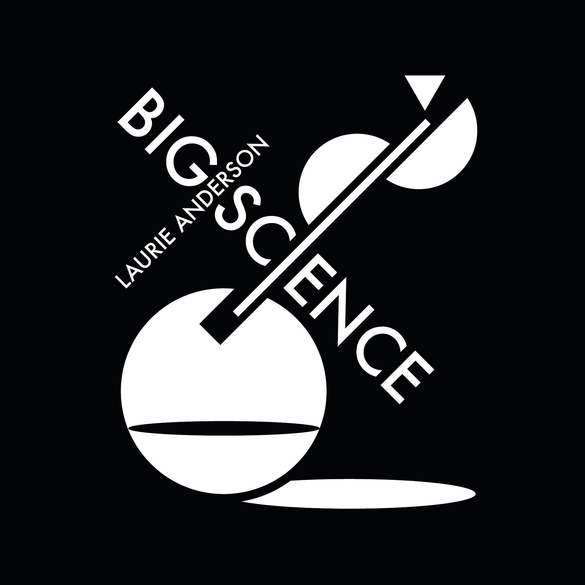
Laurie Anderson - Big Science
The main subject took inspiration from the word 'science' from the album title, resulting in abstract laboratory glassware, in this case, a flask and tube with something burning or evaporating from the tube's end.
Original artwork: click here
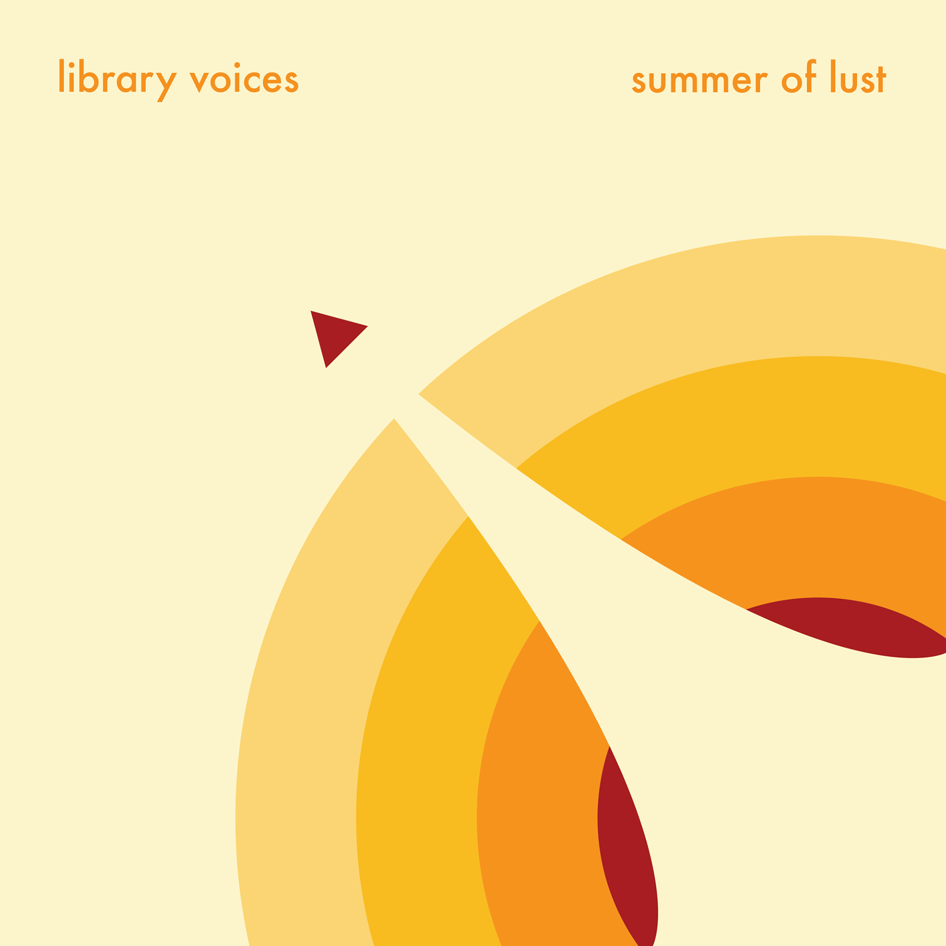
Library Voices - Summer Of Lust
The colour palette was intended to convey a warm, summery feeling, while the composition depicts a mixture of exploration, adventure and lust.
Original artwork (this is the variant I am familiar with): click here
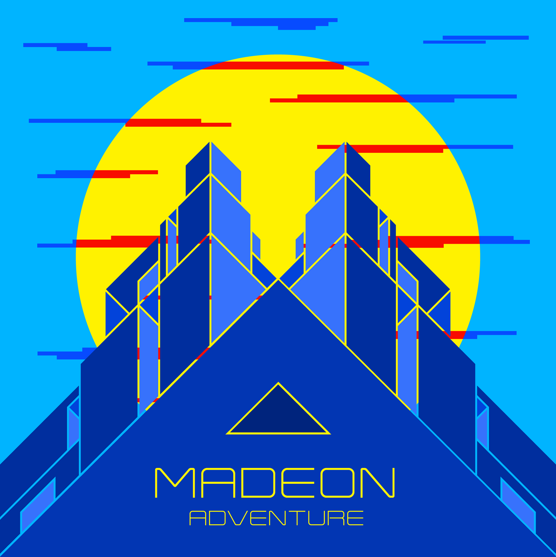
Madeon - Adventure
Running with the word 'adventure', the composition is an adventurer's view of a city looming over them from above, framed by the sun. The city utilises an isometric geometric style to create abstract buildings.
Original artwork: click here
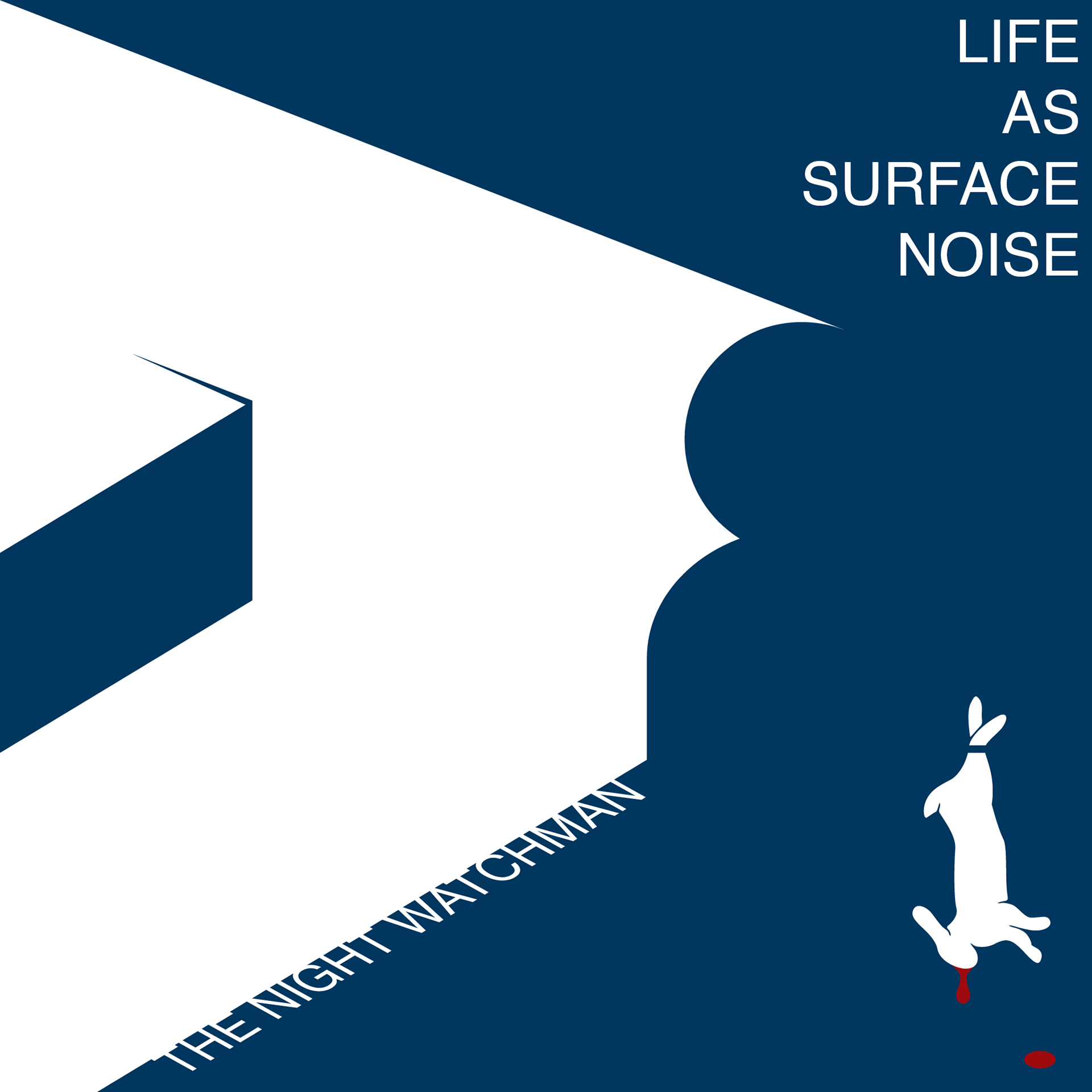
Life As Surface Noise - The Night Watchman
This EP contains spoken word to drive the narrative and this design is an abstract recreation of the story told in part 1, right down to the watchman's flashlight's beam and the rabbit he is holding.
Original artwork: click here
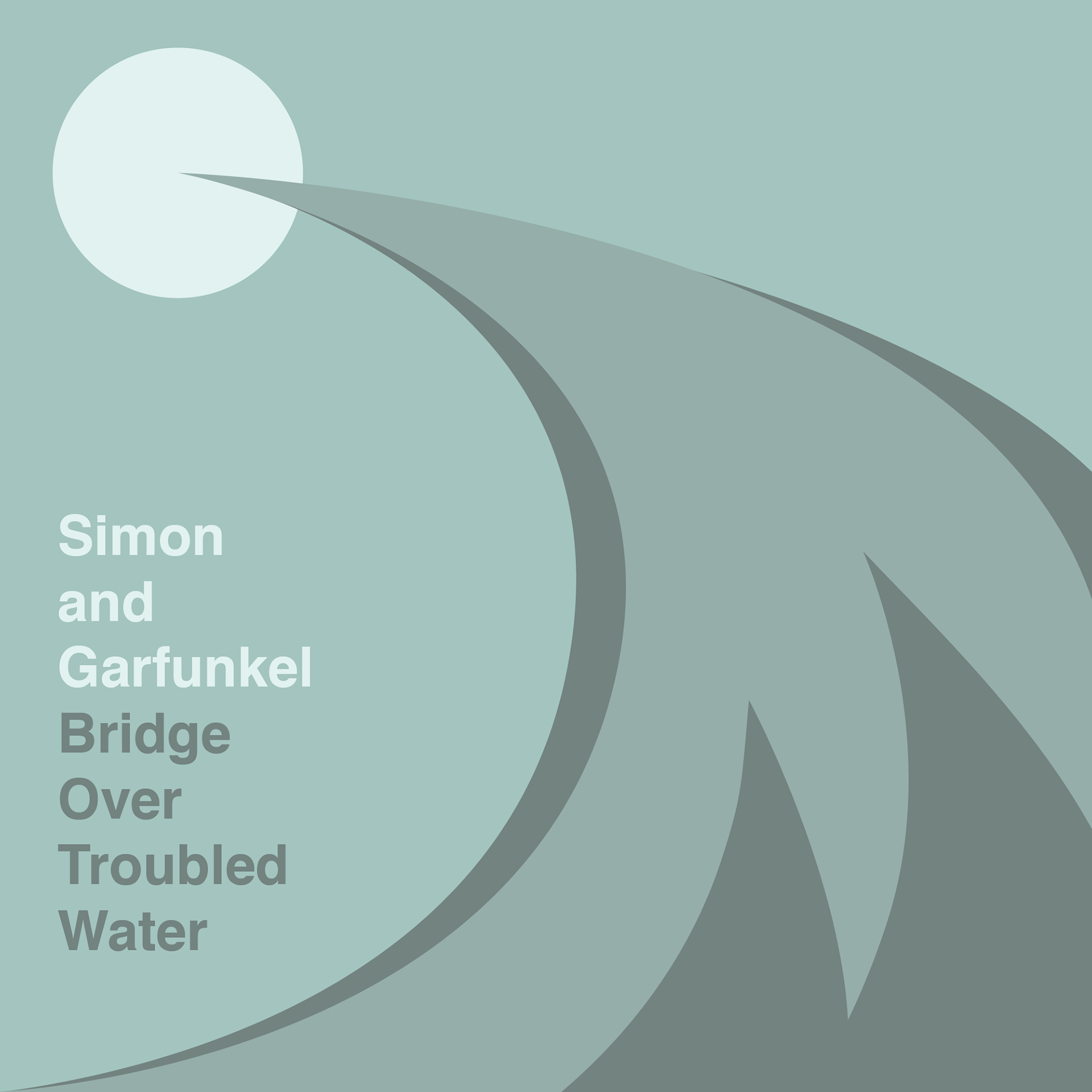
Simon and Garfunkel - Bridge Over Troubled Water
While I aimed to replicate the colour palette of the original album art as closely as possible; where I deviated was in the abstract interpretation of the album title. This design is in the category where elements of the original are retained and combined with an otherwise fresh interpretation.
Original artwork: click here