Collecting and listening to music, especially on CD & Vinyl, is an enjoyable hobby of mine, and a part of it is an appreciation of the wide variety of art styles that grace the many album covers that exist.
This series involves reimagining the album covers using a mixture of the title, music and original artwork for inspiration. Subjects are chosen from my collection or suggestions from fans and usually has an interesting title that could be interpreted several ways.
Below are 10 more highlights from the series, but more can be found on my Instagram (click here to go to my feed).
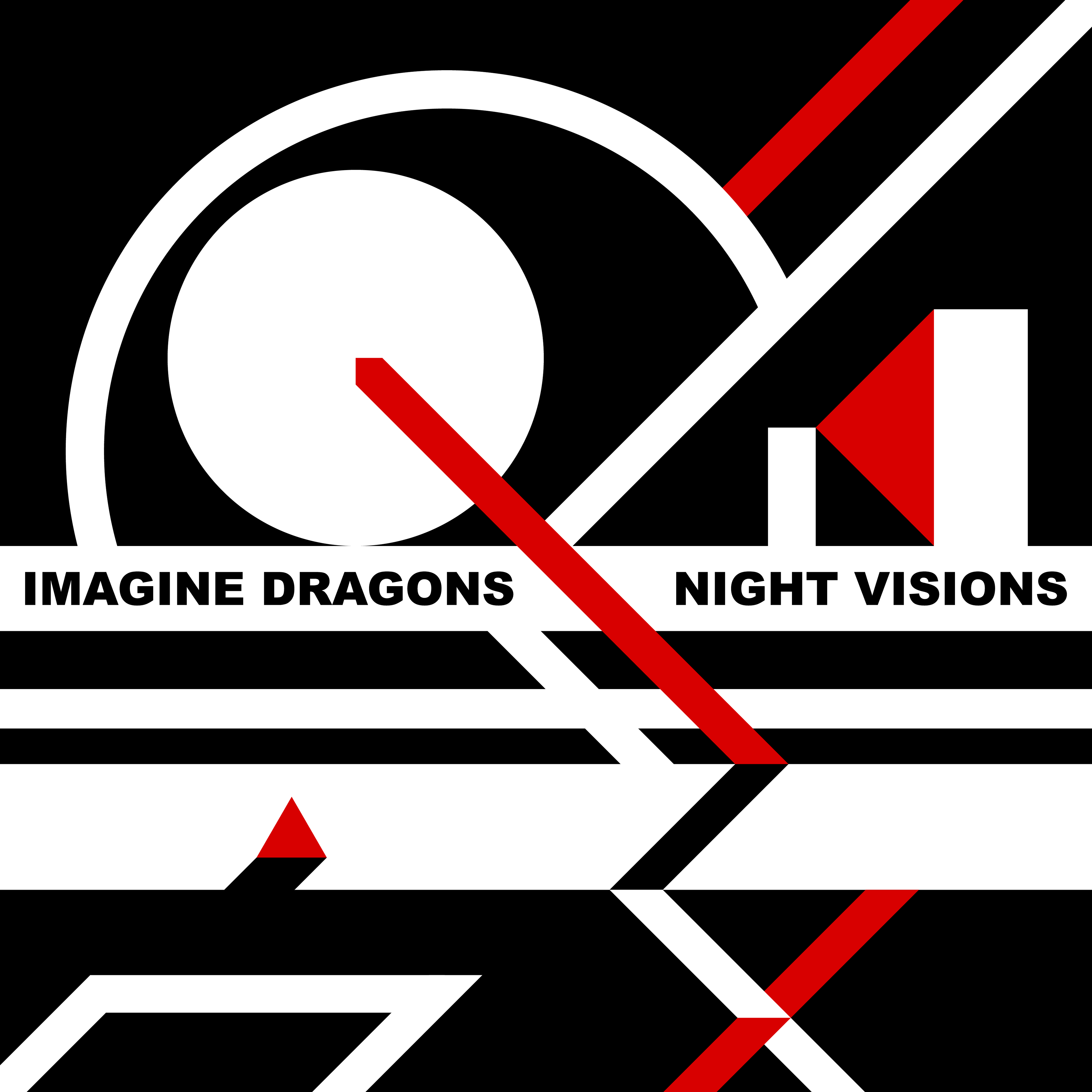
Imagine Dragons - Night Visions
The words 'night' and 'dream (drawn from 'visions') inspired compositional decisions such as the colour scheme and subject matter. A moon or other planetary object primarily seen at night looms over a cold, forbidding desert.
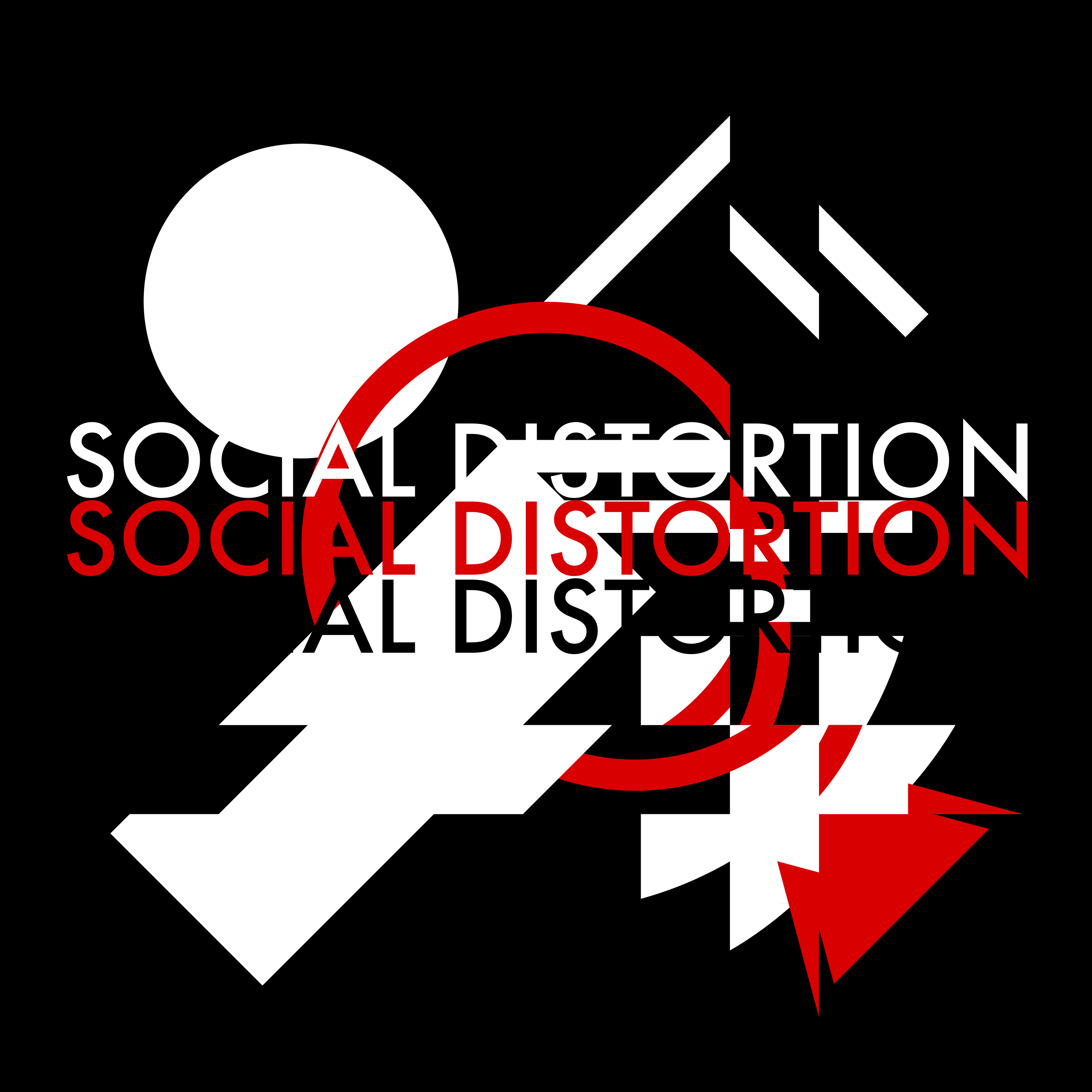
Social Distortion - Social Distortion
To create disorder amongst my normally organised compositions, I skewed the composition in several places. This was achieved by selecting a strip of the composition, cutting the shapes at either side of the strip, then moving all these new shapes a set amount along.
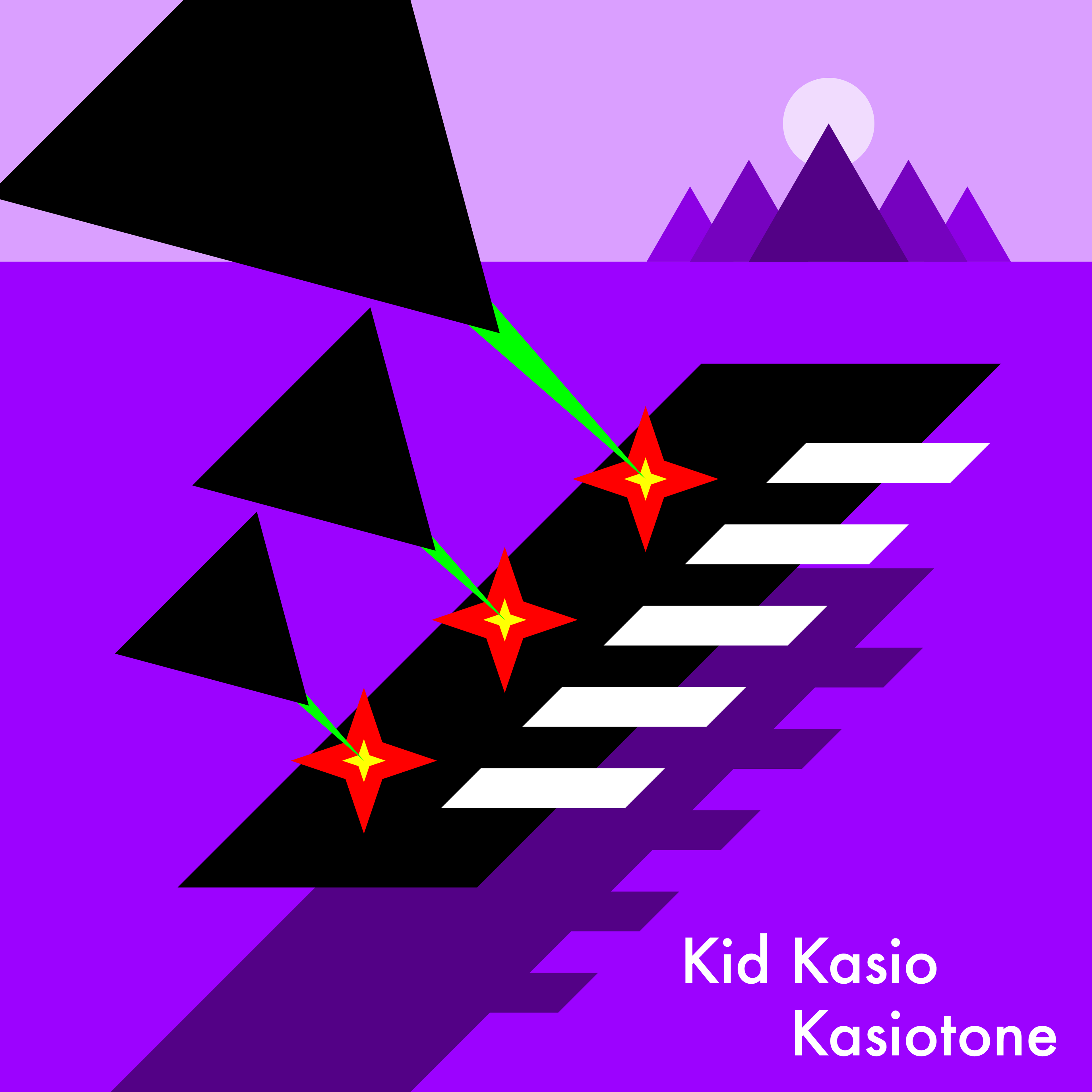
Kid Kasio - Kasiotone
Kid Kasio's music is distinctly 80s and synth driven, which influenced the neon colour scheme and dramatic 'keyboard air battle'.
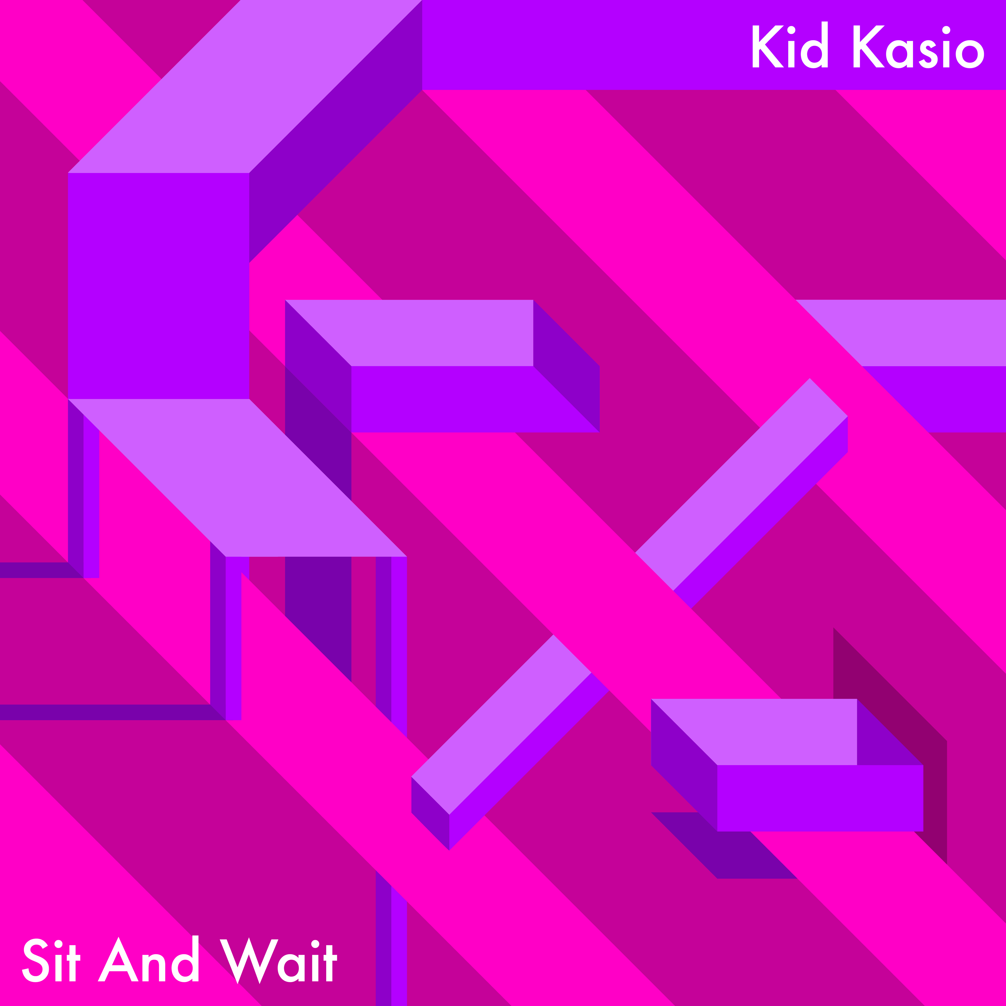
Kid Kasio - Sit And Wait
Like with the previous Kid Kasio re-imagining, his style influenced the colour scheme. This time, however, the composition focused on 3D and impossible objects with a chair as the centrepoint.
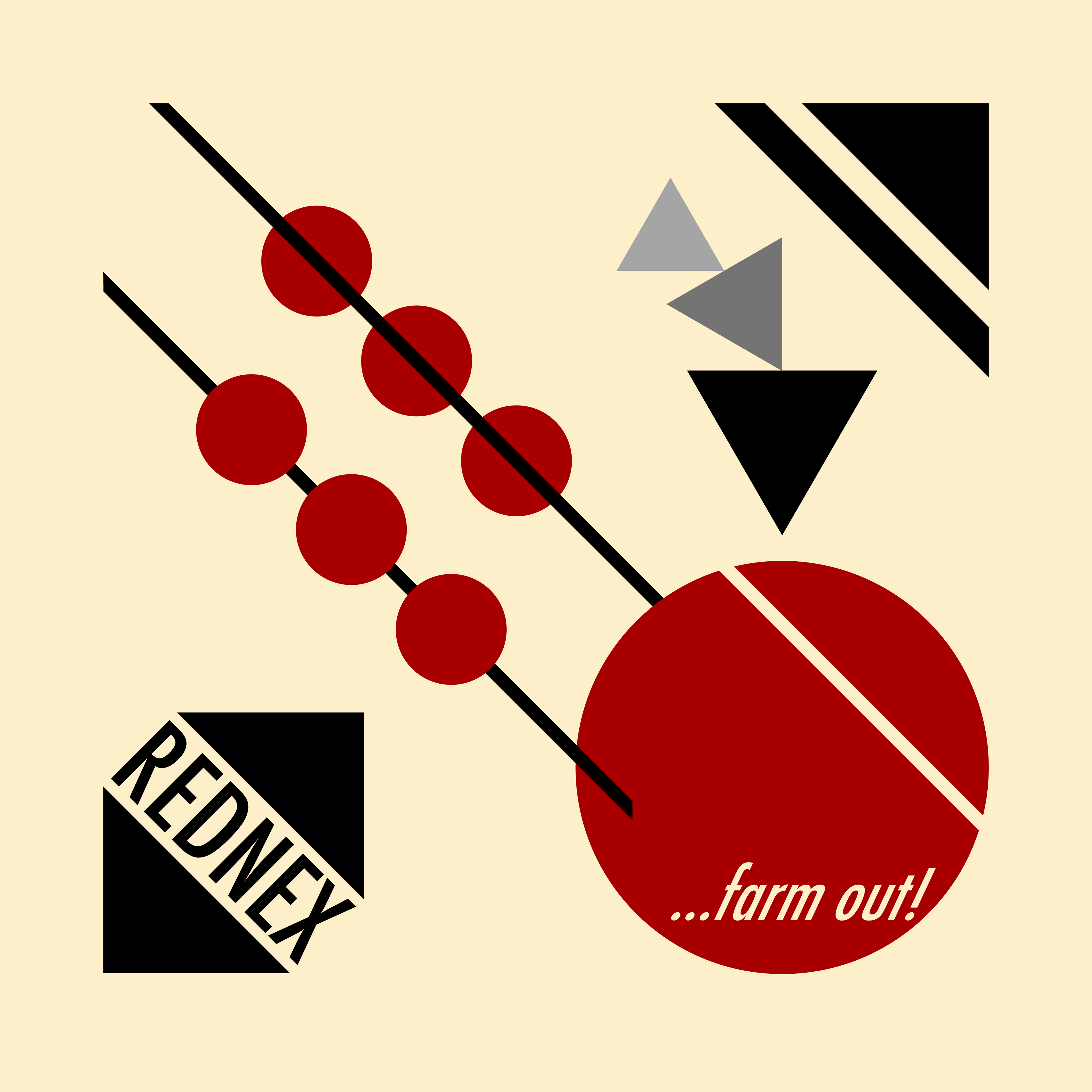
Rednex - ...Farm Out!
Rednex's style centres on the 'deep south redneck' stereoytype, which influences their image and music, the latter of which is Eurodance with banjos and fiddles throughout.
The central subject is an abstract representation of a steam train inspired by their music video for 'The Way I Mate', while the presentation of their band name and background colour evoke a wild west poster (minus the cliche typeface).
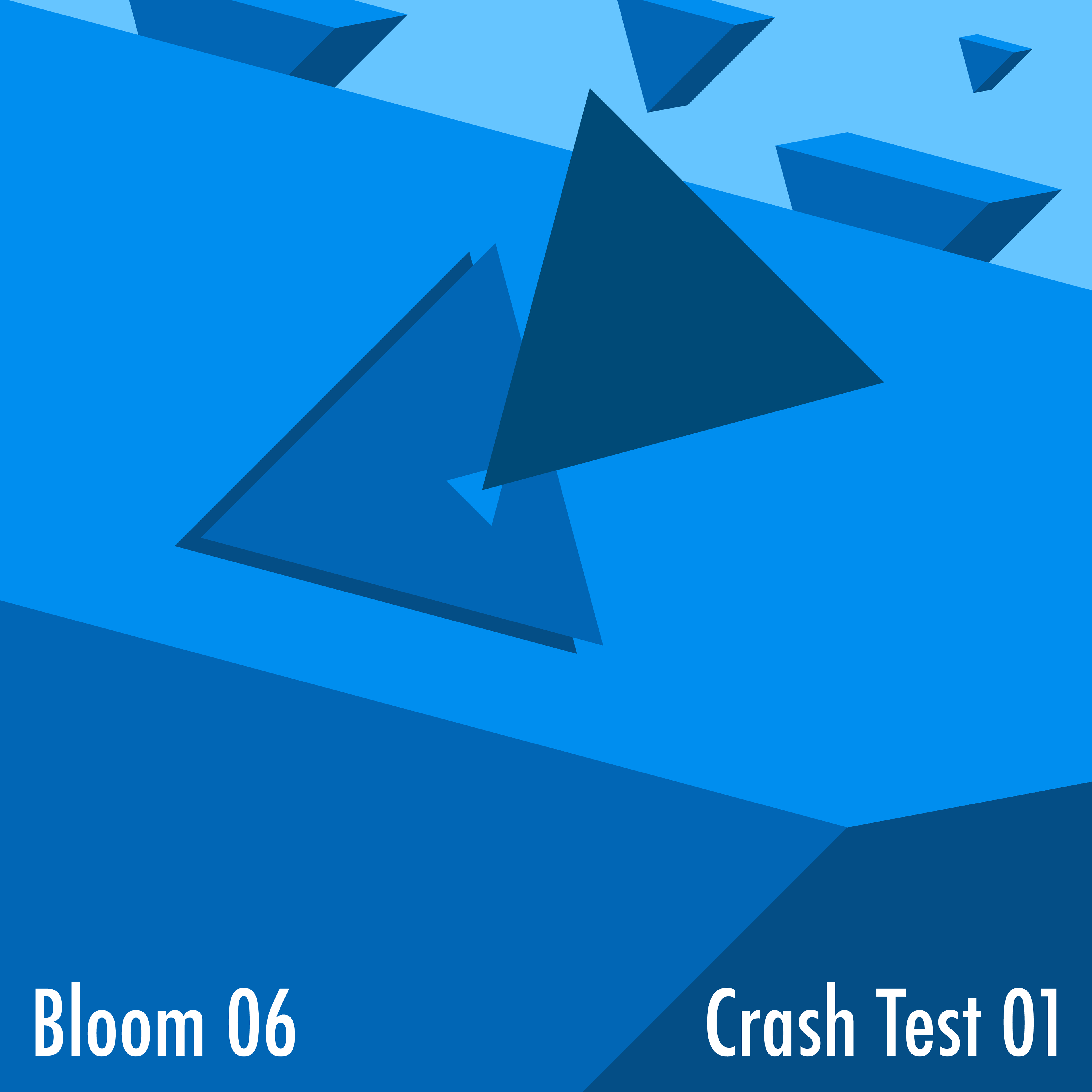
Bloom 06 - Crash Test 01
With this design, I took the title literally and made the main subject an aggressive crash between two of the sharpest shape, the triangle.
This design also marked the first to feature the floating prisms that loosely formed their own narrative.
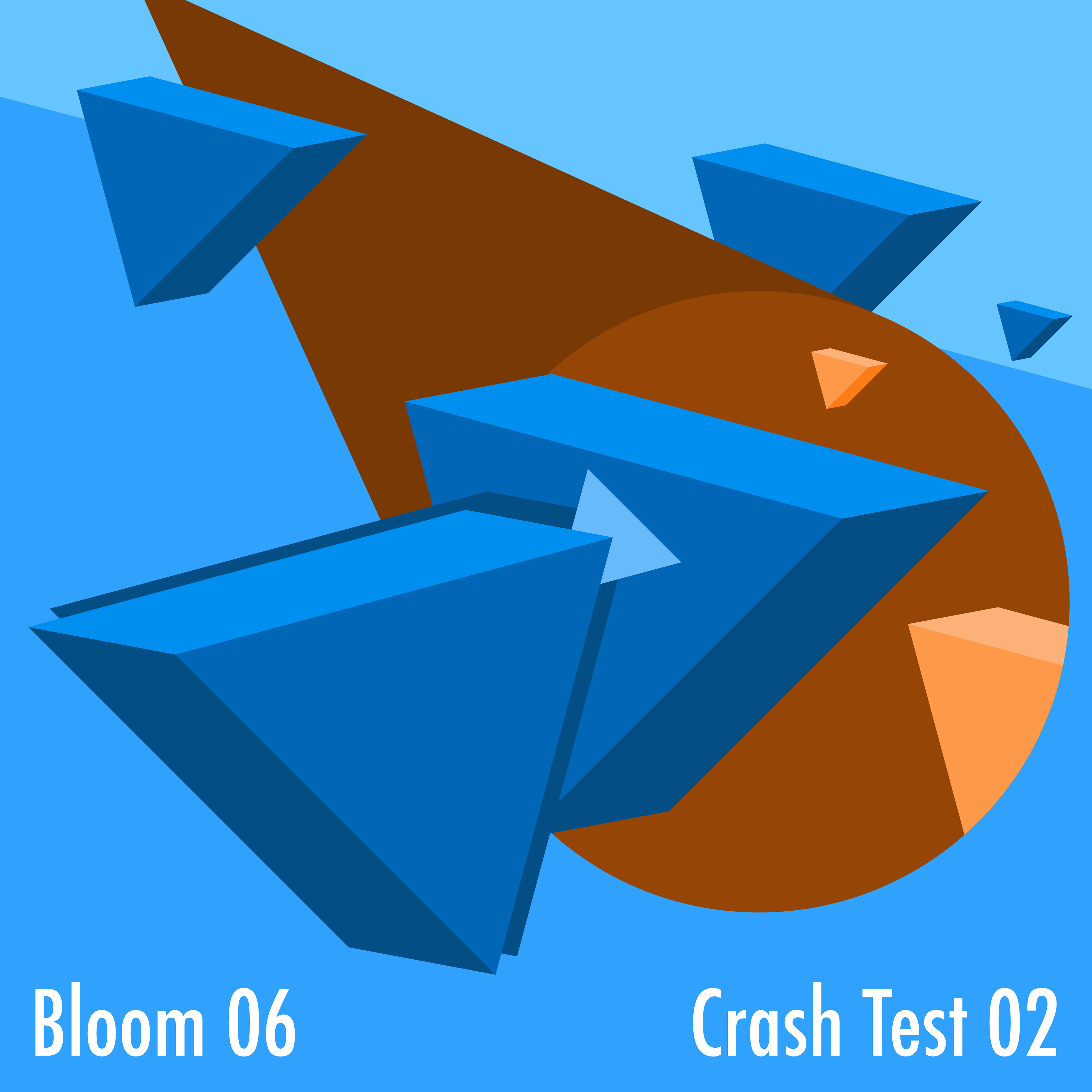
Bloom 06 - Crash Test 02
On the success of my re-imagining of their first album, I built upon the original concept for a re-imagining of their second.
This time, the prisms that were previously in the background now took centre stage. The design was taken further with a portal to the mirror universe, which added a much needed colour contrast to draw the eye.
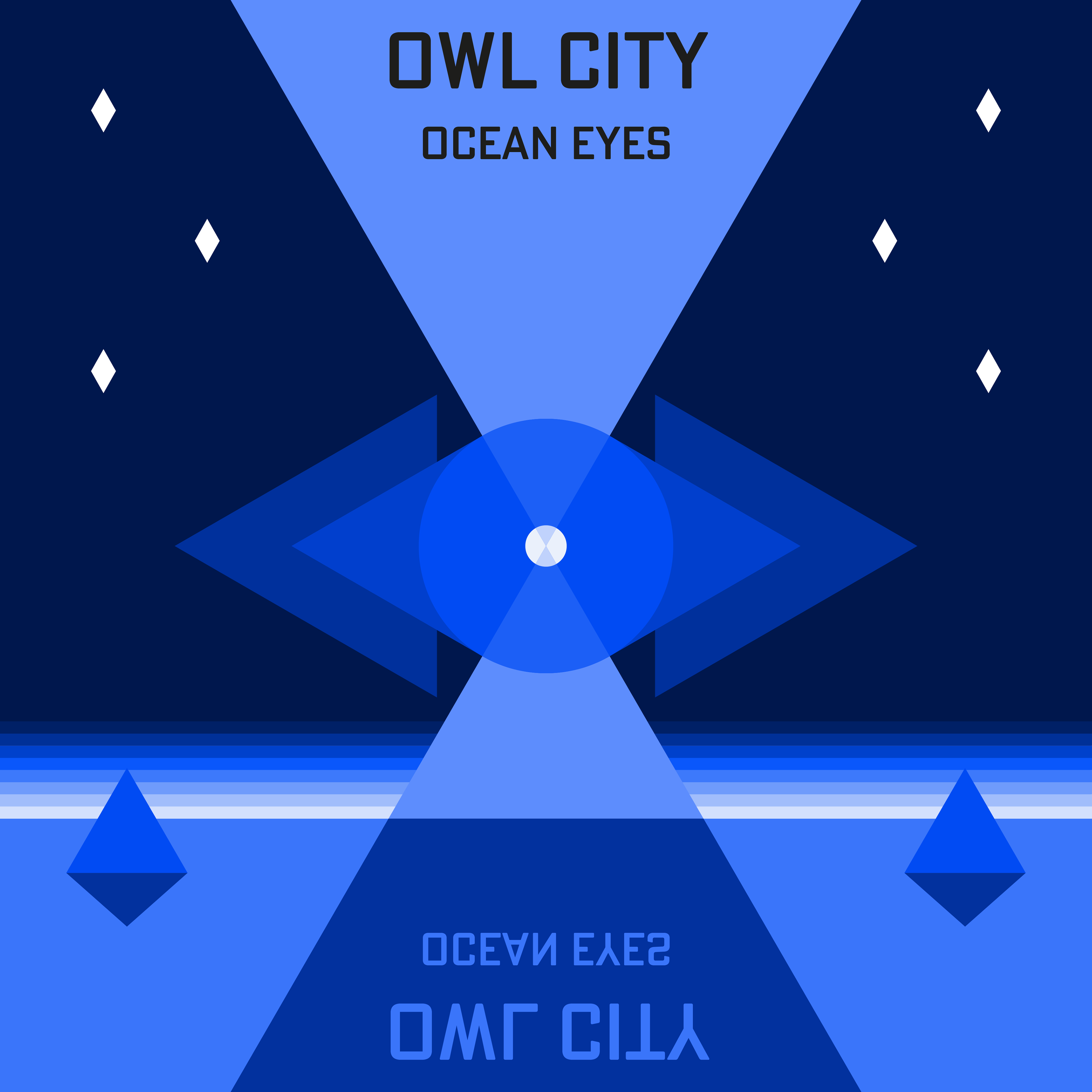
Owl City - Ocean Eyes
The main theme that I got from this album was one of 'nostalgia' and 'dreams', which became the inspiration for this dream-like composition of a night sky over a sleeping planet. The depiction of light over the horizon was inspired by retro videogame depictions of the sun rising/setting.
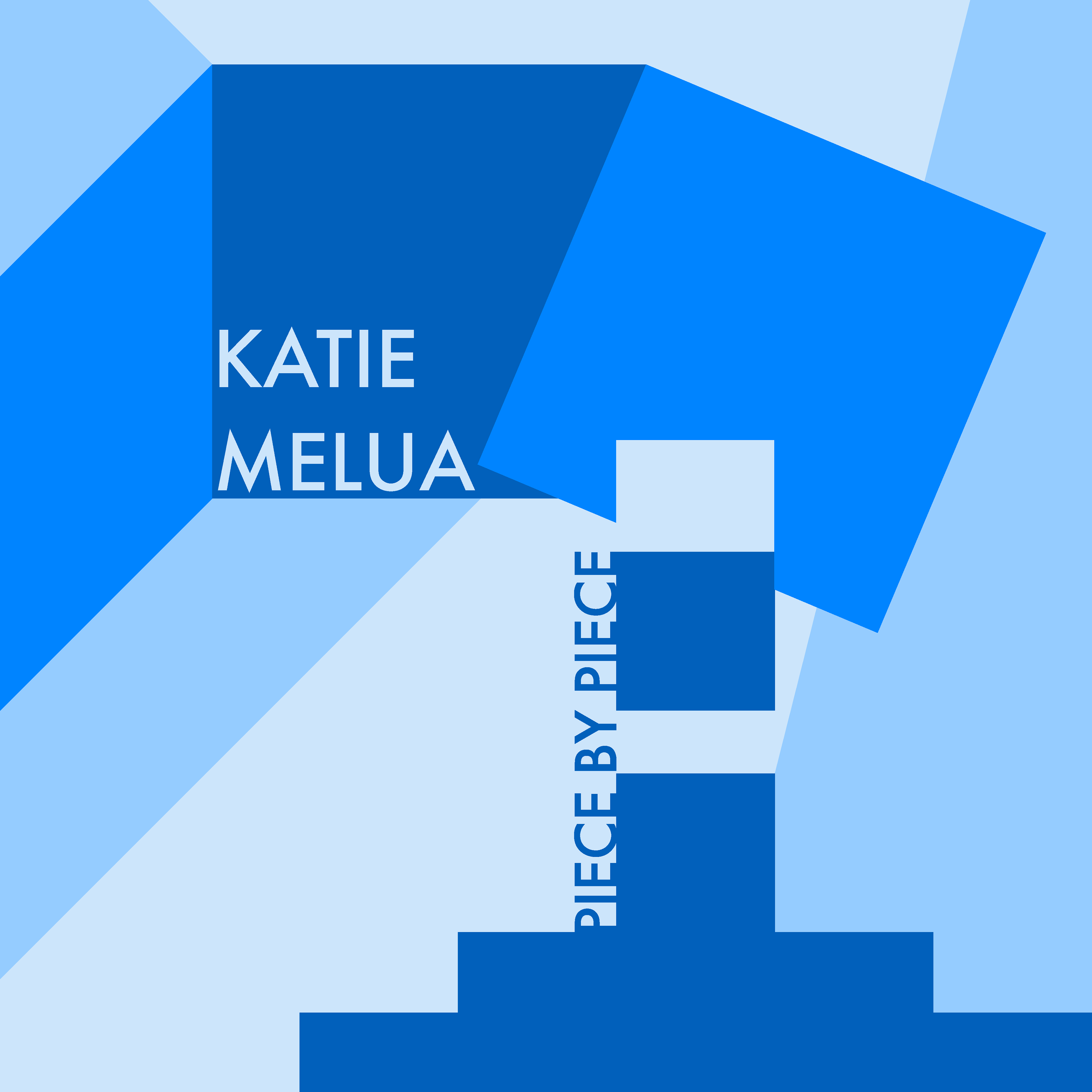
Katie Melua - Piece By Piece
Taking a literal approach with this abstract 'block stacking' composition, the colour palette reflects the soft, coolness that I get from this album's music.
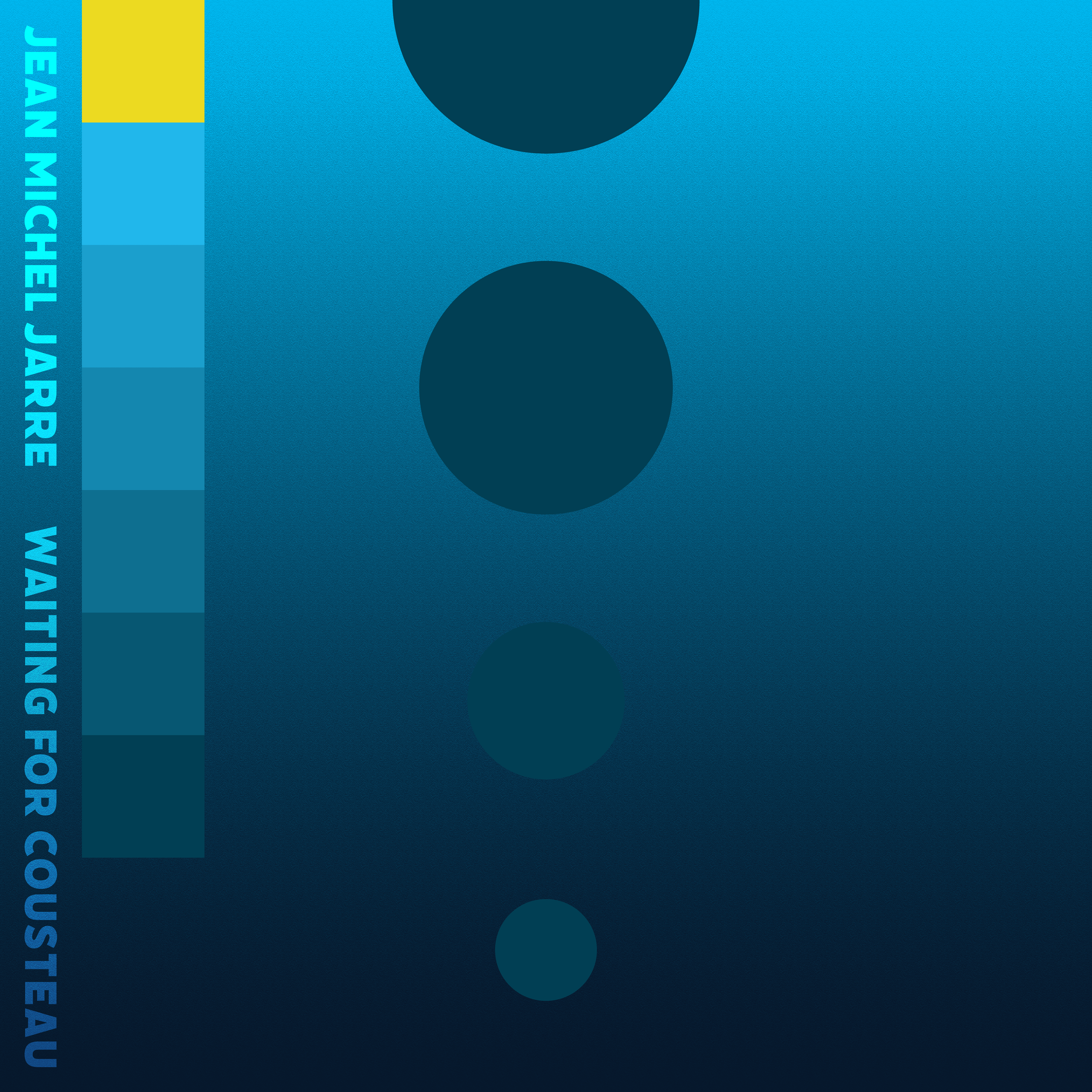
Jean Michel Jarre - Waiting For Cousteau
The themes of this album are based around the sea, especially tropical waters, as evidenced by the title's reference to oceanographer Jacques Cousteau. The title track is a minimalist exploration to the deepest depths of the ocean blue, which influenced my design's composition depicting that descent into darkness.
The descending spheres appear to lighten against the darkening gradient, but this is a visual illusion because they are all the exact same colour. The coloured squares in the corner represent gauges monitoring depth or pressure.