“'Electronic Space - Volume One' is a sublime collection of electronica with a very loose, intergalactic feel.”
I was commissioned to design album artwork to be used primarily for its listing on Bandcamp.
The following two designs were created during the initial idea generation stage and explored quite different compositions based around the space theme.
The first features two astronaut helmets depicted as large spaceships, one aggressively colliding with the other, creating a shockwave as a result.

The second design features a rocket ship taking off in a much more organised and symmetrical composition, prompted by pictures of old sci-fi and Soviet propaganda imagery provided by the client as inspiration.

While neither design was chosen in it’s entirety, an astronaut helmet from the first was repurposed for this composition inspired by one of the Soviet themed images serving as inspiration (https://images-na.ssl-images-amazon.com/images/I/61wlFjNdRTL._AC_SL1001_.jpg).
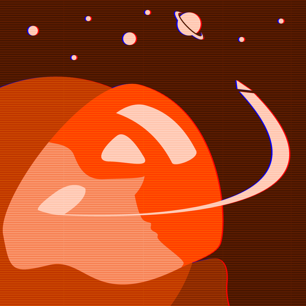
A brief experiment involved the use of CRT TV-style scanlines and the red and blue colours slightly separating to add to the retro aesthetics. However, this was deemed too gimmicky and was quickly dropped.
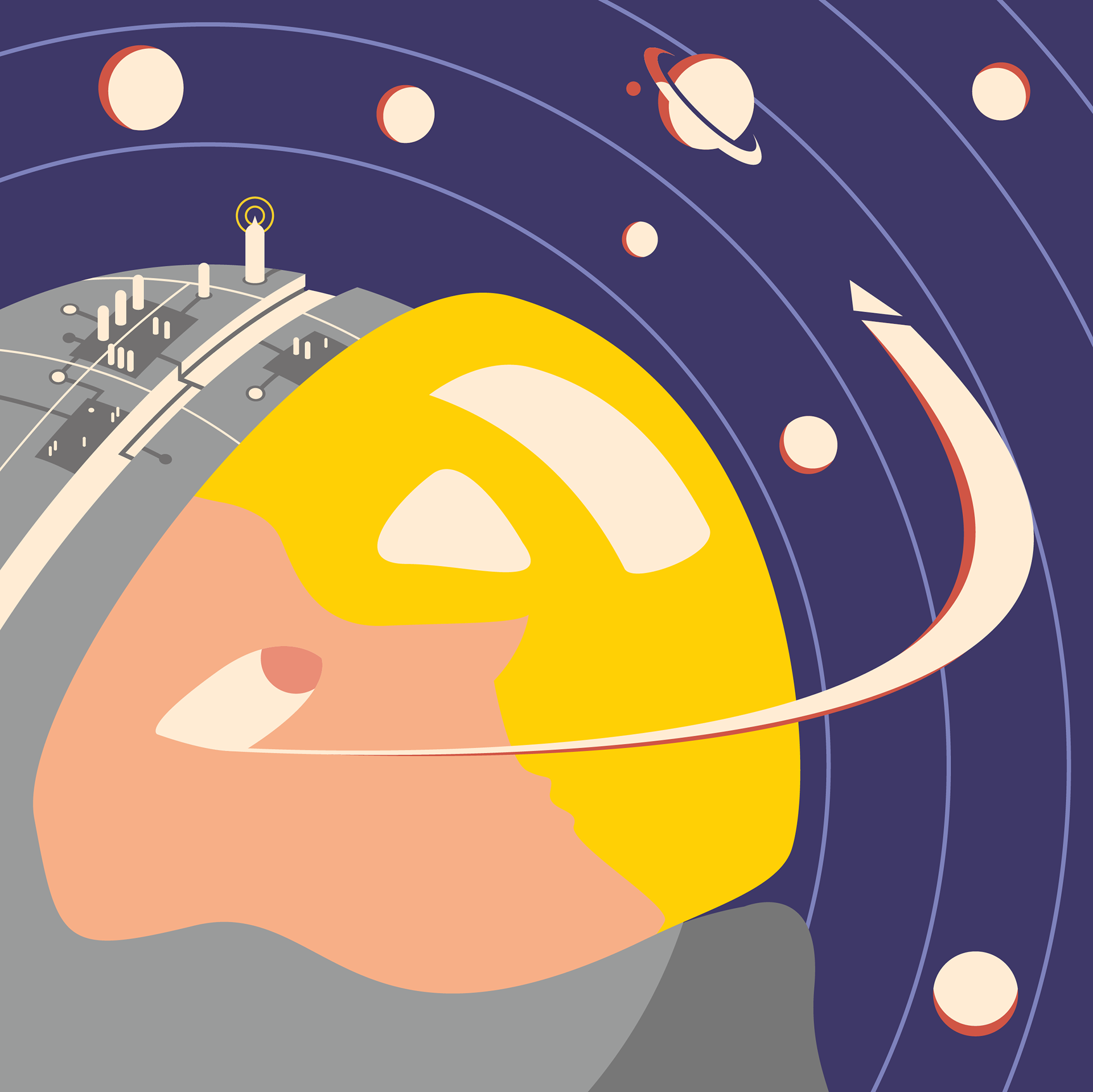
The Soviet inspired red colour scheme was gradually dropped in favour of a colour scheme inspired by old sci-fi designs. An eye was added to the subject to by client request and the planets were rearranged to make space for the various bits of information that would be added since it was to be album art. This draft also features the typeface ‘Sketch Book’ as an initial placeholder chosen by the client.
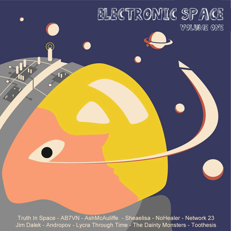
The eye changed position and colour to better fit the composition and so they appeared to look beyond the stars / at the album title.
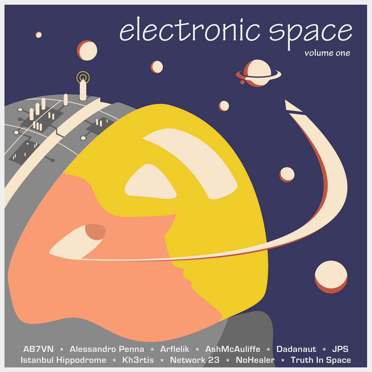
This is the final design agreed upon by the client. Various other typefaces were considered until ‘Tekton Pro’ was chosen and the artist names were rearranged alphabetically. A thin off-white border was also added to frame the composition.
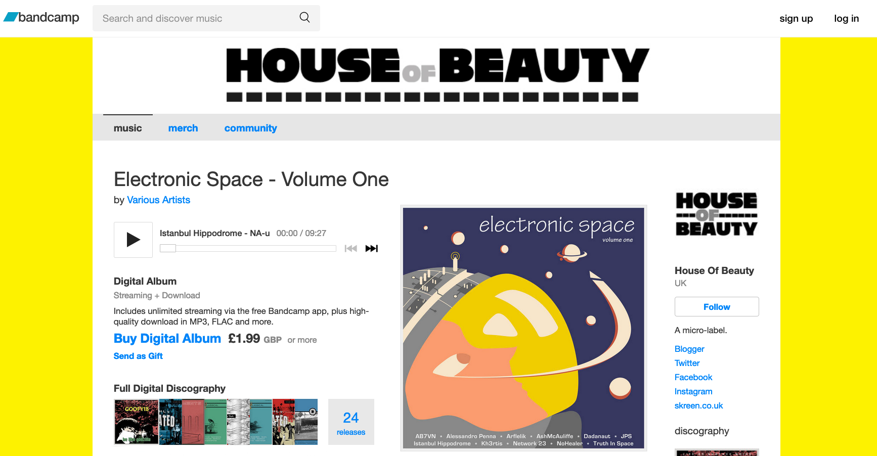
Below is a screenshot of the Bandcamp page with the final design featured as the album artwork.
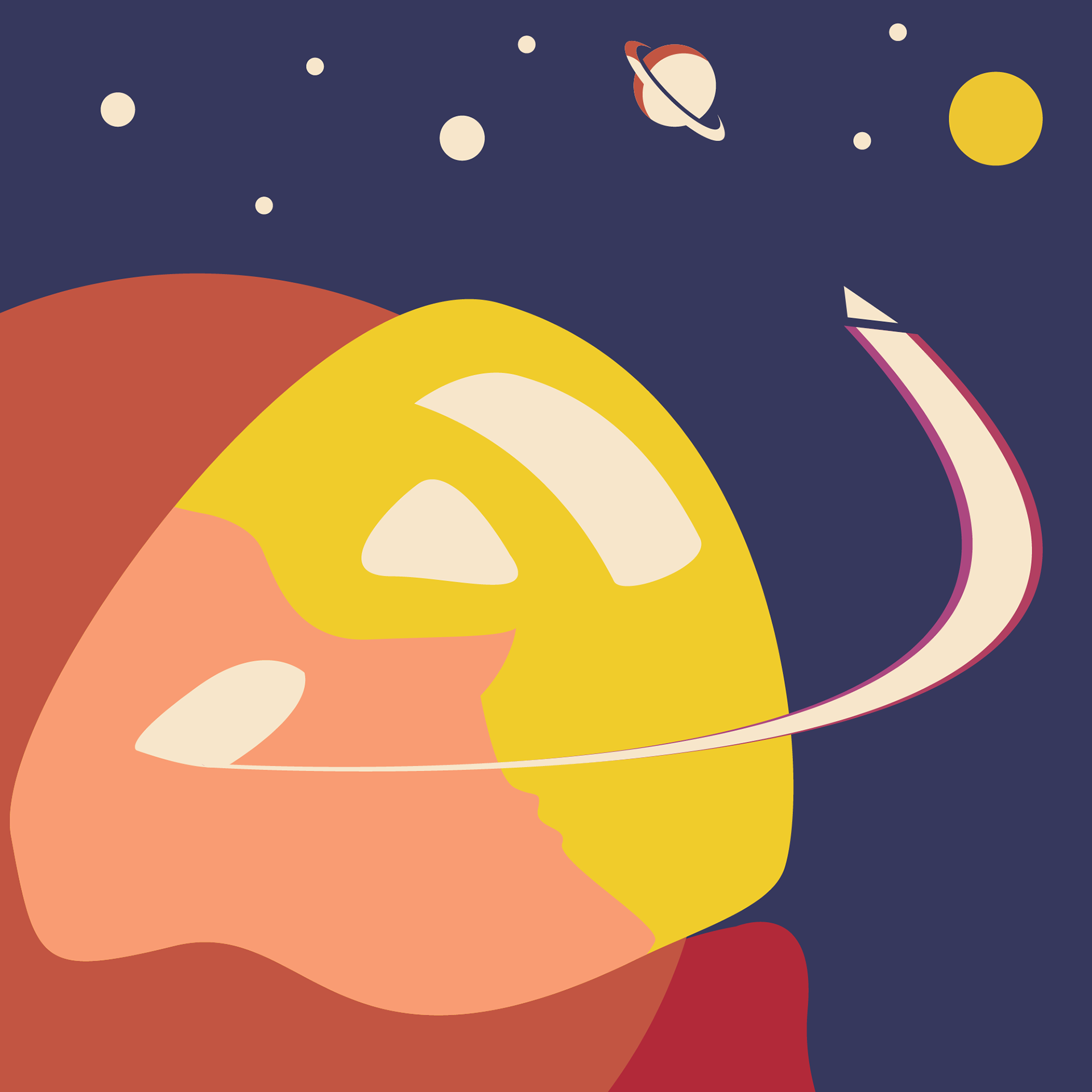
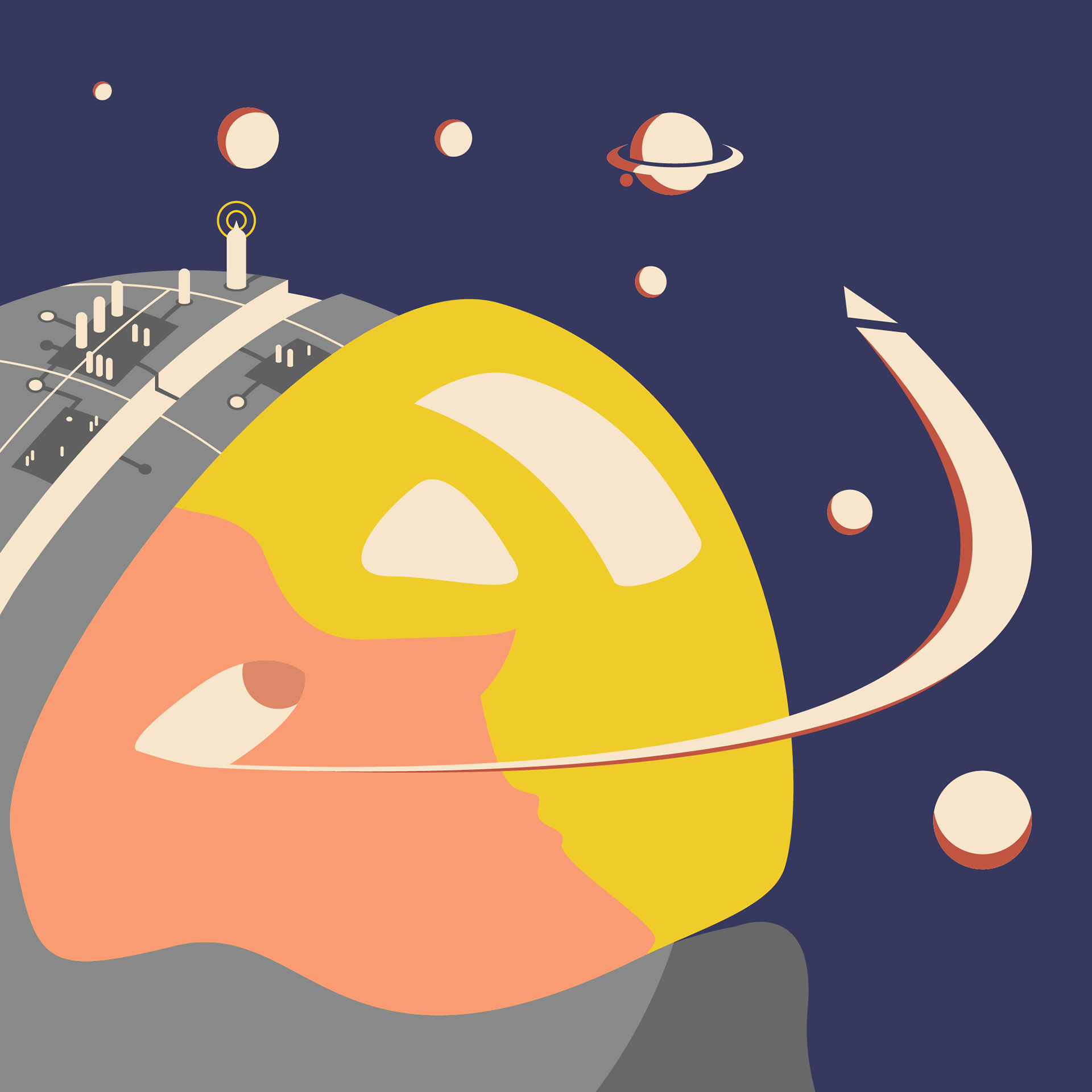
The design was later used for an entry into an exhibition, sans the text and with the client's permission. Changes were made to the location of the planets to account for the lack of text. In addition, rings radiating from the astronaut were added as well as fine tuning done to the circuit city on the helmet.