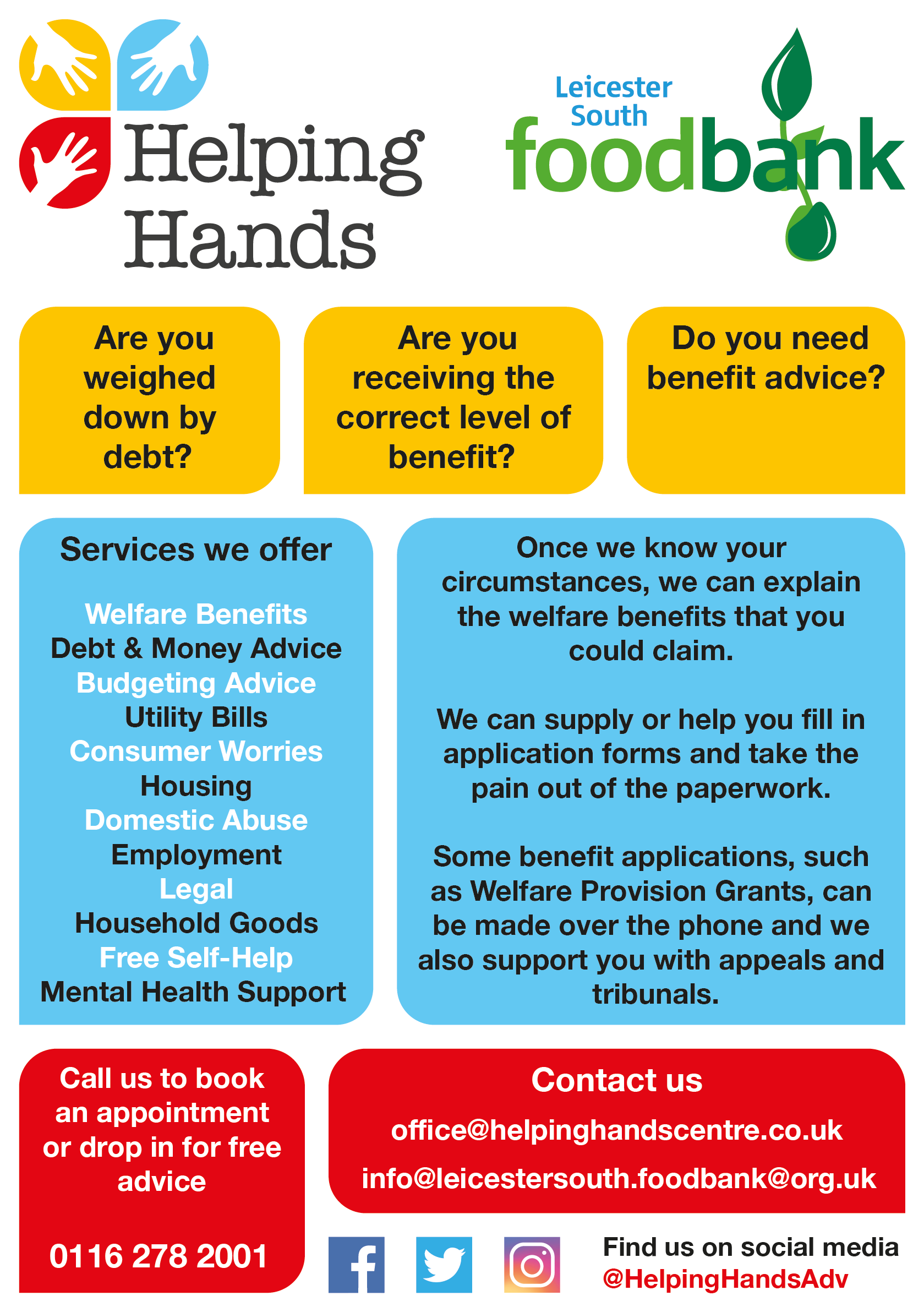
This A5 leaflet for Helping Hands offered a greater challenge than the council commissions in regard to colour palette due to the inclusion of a third colour (besides black and white). With two, it is easier to contrast or alternate between them, whereas with three I had to take a different, more considered approach.
Initially, I alternated the colours in an imitation of the Helping Hands logo. However, it was deemed somewhat cluttered, so I divided the information into categories and colour coded them accordingly. In this case that meant rhetorical questions backed in yellow text boxes, services offered in blue and contact information in red. The text boxes also have three curved corners and one square in a simple representation of a speech bubble.
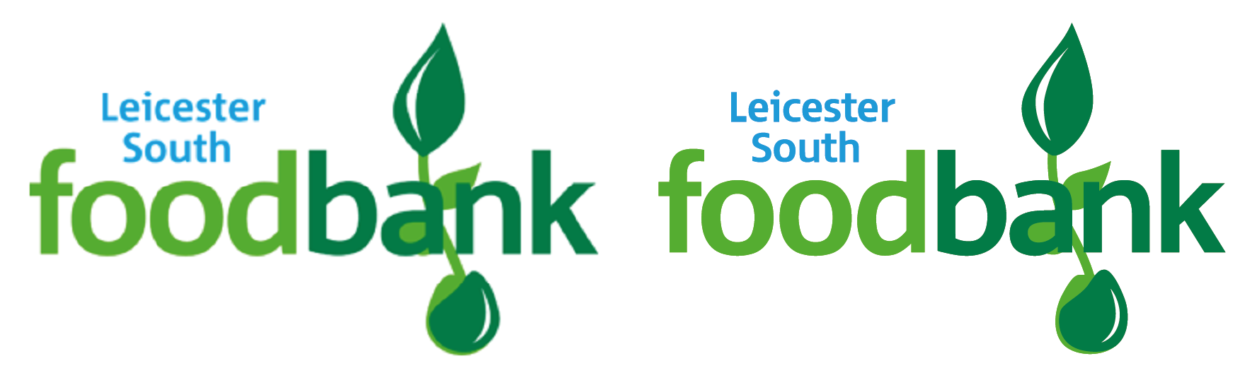
The Helping Hands logo was provided as a vector but the Leicester South Foodbank’s was not, so I gained permission to recreate it like with various commissions for Oadby and Wigston Borough Council.
The left image is the original and the right is my recreation. Unlike the Active Oadby and Wigston logo where I combined traced lettering with substituted fonts, this recreation was done entirely through a combination of screenshots using font source websites, the Image Trace tool in Illustrator, and manual touching up.