Alongside my more predominant abstract minimalism styles, I also develop my skills in character design and these characters are then developed in my creative writing.
My oldest and most drawn character is Verin, a female demon named after the Christian demon of laziness.
Over time her design has undergone many changes and my discovery of vector graphics has fueled this unending quest for perfection. What follows is a look at a single drawing and what changes and why.
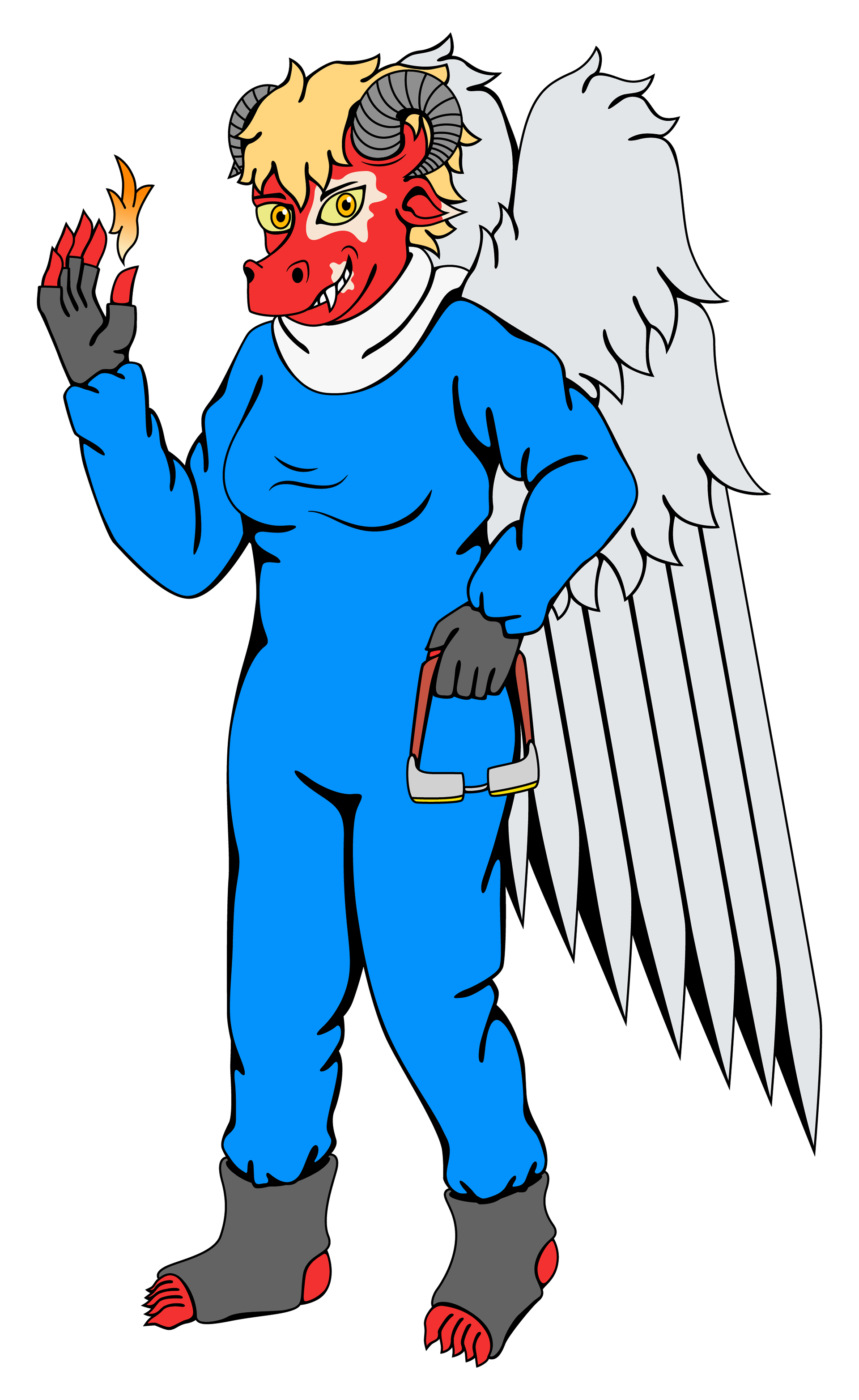
First is the original pencil drawing (henceforth referred to as v.1.0), identified as 'Verin 61', which primarily serves as a framework for the digital image rather than a finished drawing in its own right. The fire coming from her fingertips is part of an aspect in my creative writing in which demons can conjure 'demon-fire'. A later addition to the previous major digital drawing added a white scarf that resembled a World War 1 pilot's. This change was therefore included in v.1.0. Continuing the flight theme are the googles in her left hand.
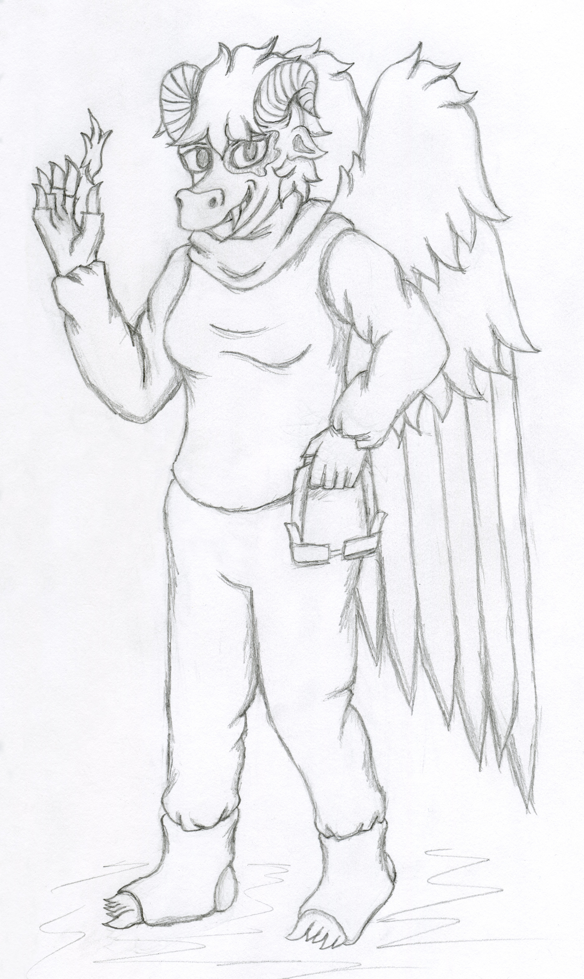
Verin 61 pencil sketch, or v.1.0 for the purposes of this project
Version numbers are used to help organise each iteration. Version 1.1 stays fairly close to the original, although the vitiligo facial markings on her mouth and ear were not in v.1.0. In previous digital drawings, her clothes, gloves and foot straps were various shades of blue, but for v.1.1 I tried colours closer to the rest of the colour palette.
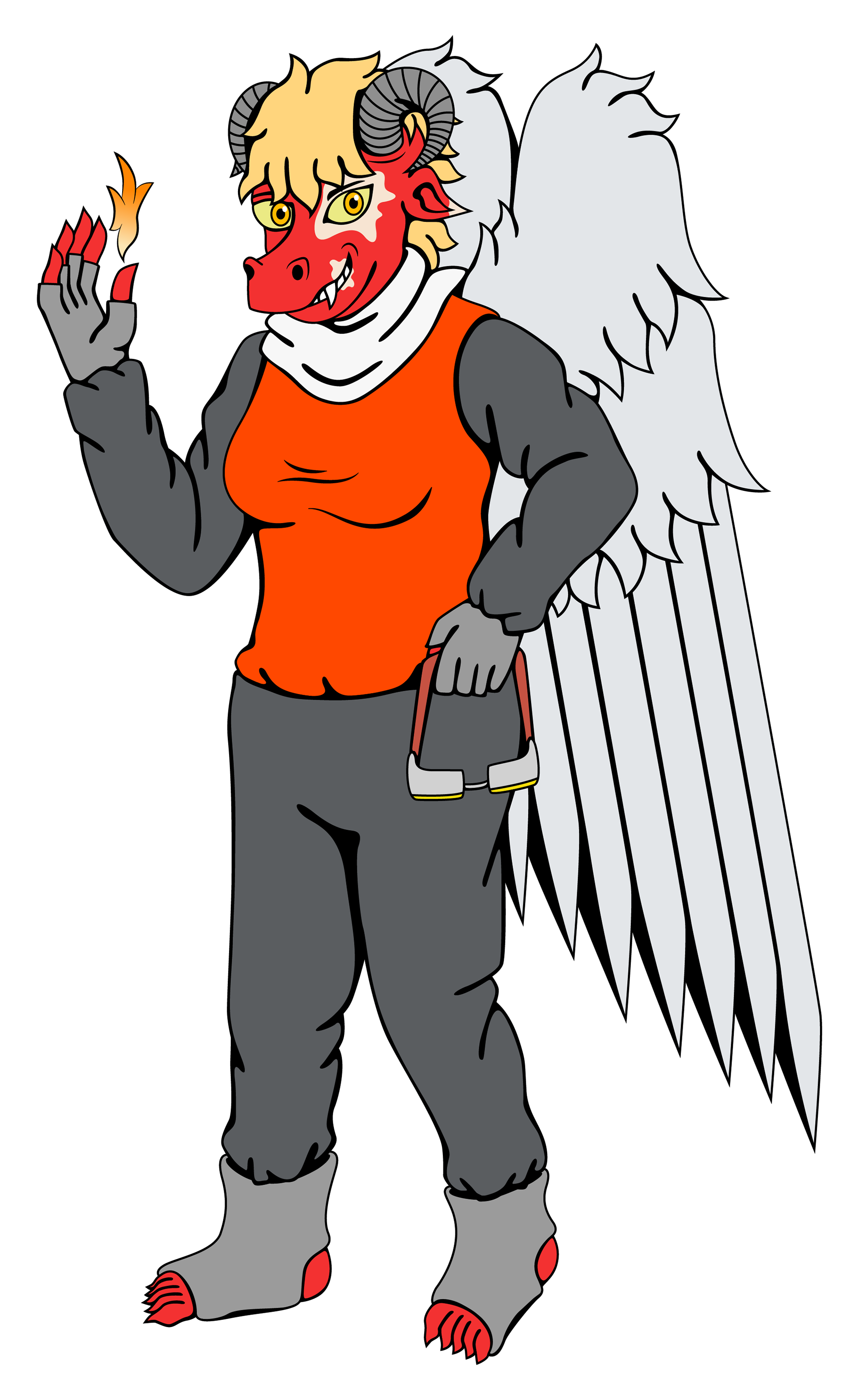
Verin 61 - v.1.1
V.1.4 is the next major iteration and most noticeably reverts to the aforementioned shades of blue as it was decided that the contrast in colours worked better as it made her red skin stand out more. Another noticeable change involved improvements in the shape of the scarf, giving it a smoother look. Also, older drawings of Verin featured her with a more human shaped face, but this has since developed into a snout, which I am continually improving in depicting from various angles. Facial improvements can be seen in how the hair and horns have changed between these two versions.
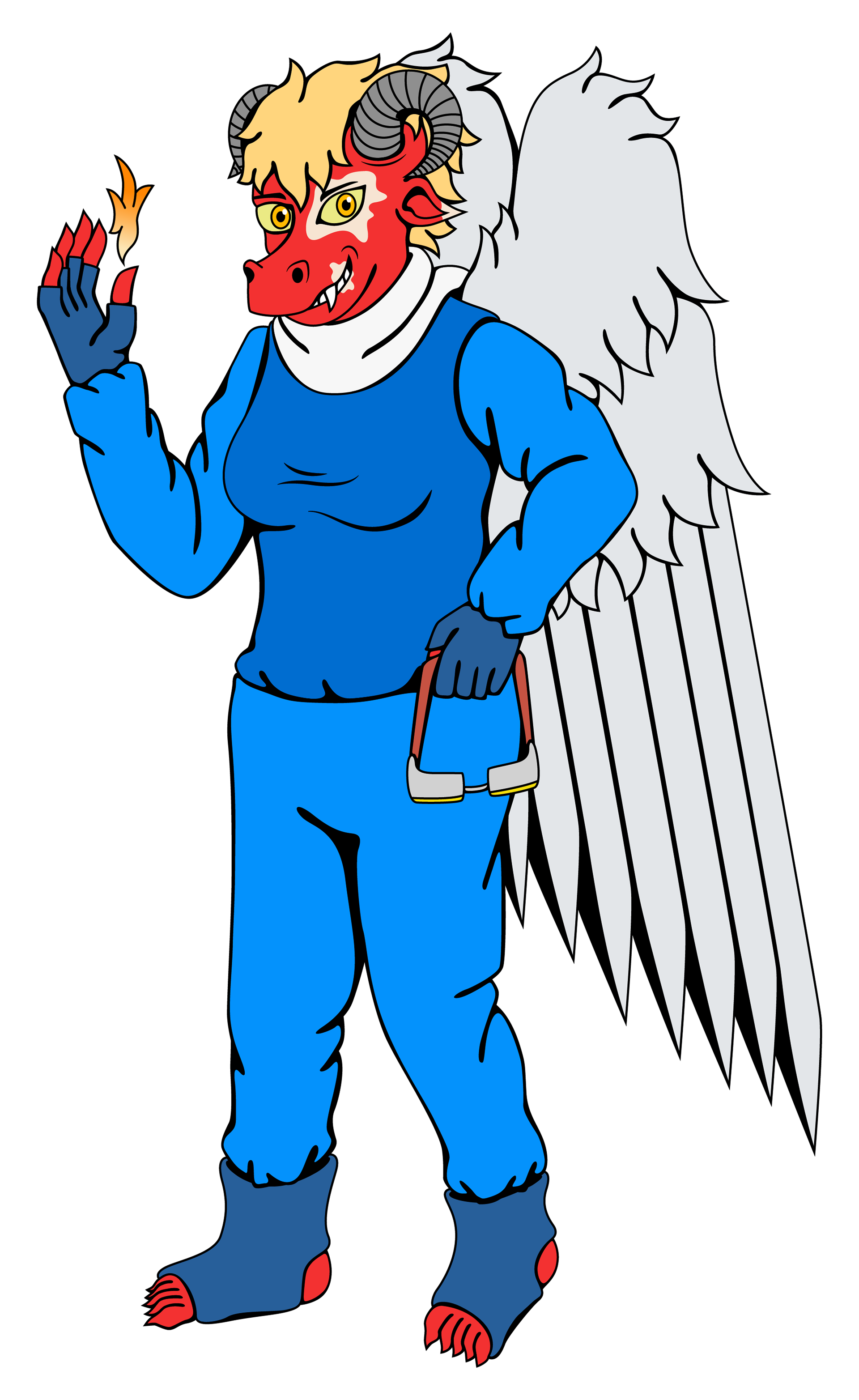
Verin 61 - v.1.4
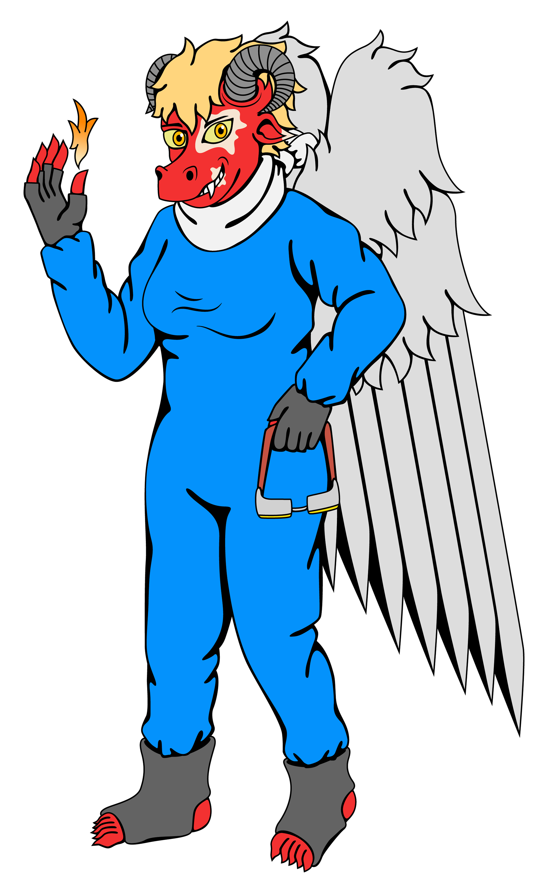
The major change in v.1.7 is the alteration of her clothing from sleeveless vest over a long-sleeve t-shirt tucked into tracksuit bottoms/sweatpants into a boilersuit/coveralls. This style of clothing has appeared on other characters of mine and is partly because I find that they can reduce unnecessary detail, allowing it to be focused on other aspects and also flow better without interruptions such as belts.
Verin 61 - v.1.7
V.1.93's major change is in how her scarf is gathered: instead of the ends hanging down her back, between her wings, it is instead knotted at her nape. The decision for this change was based on practicalities in-universe because a loosely hanging scarf may cause a distraction while she is in flight.
Verin 61 - v.1.93
Focus remains on the scarf in v.1.97, in which the changes have been twofold. Firstly, the knot in the scarf has been replaced by a brass ring or other such fixing. Secondly, the shading in the fold along the middle of the scarf continues uninterrupted and shading of the scarf overall has been improved to give it more shape and definition.

Verin 61 - v.1.97
Going back on previous assertions that coveralls worked through lack of belts interrupting them, I experimented with a belt with belt loops in v.2.2 because I had decided that perhaps the lack of detail on the coveralls made them look too plain and featureless.
The brass ring/fixing has been replaced by a brass hex nut. Matching this is a hex nut she is showing of, which replaces the demon-fire she was conjuring. These changes were part of a creative writing idea at the time involving her scavenging metal either as a job for a blacksmith or as a metal sculptor.
Following this new metal fixing/machine parts theme is the addition of gear patterns on the scarf, which also make the scarf more visually interesting and break up the solid colours.
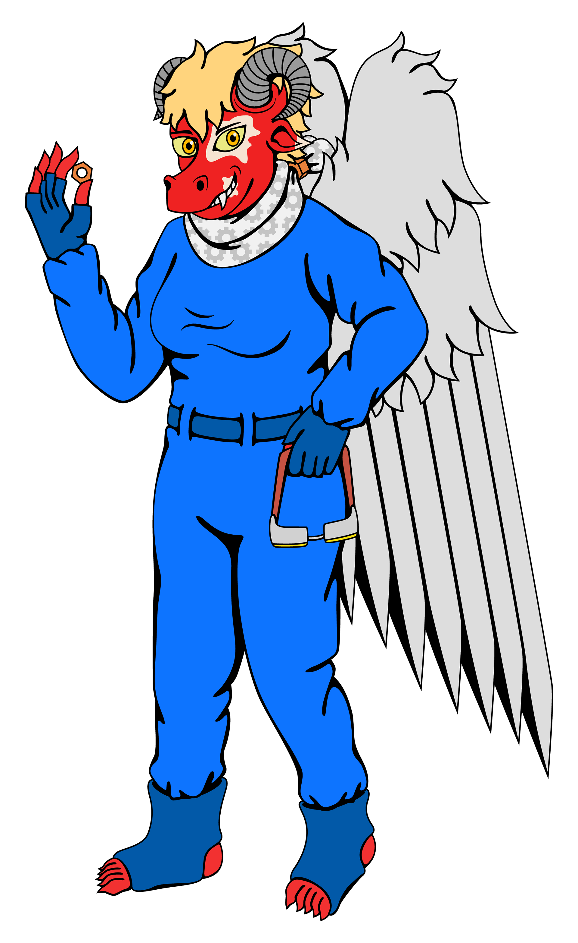
Verin 61 - v.2.2
One of the major changes is that the googles are removed (but not necessarily from her character's wardrobe, just this particular drawing) and her arm is moved upwards so that her hand is now tugging/adjusting her scarf. This change was made partly due to how awkward she held her hand against her hip.
Another change was the improvements to how I draw her horns; drawing curved horns can be difficult, especially from this angle. However, through the course of this series of changes, I have been able to gradually improve.
Also, after removing the belt from her coveralls, I instead added a zip running down the front. With the contrasting colour and simple trio of parallel lines, this proved to be a better executed addition than the belt, whose colour blended in and whose perspective in relation to Verin's body was off.
A minor change was an increase in the number of teeth visible in her grin to show a greater contrast in size between the protruding canine and its neighbours.
Finally, my typeface 'Verin Slab' (Verin is its namesake) makes an appearance as the numbers '5462' on her coveralls.
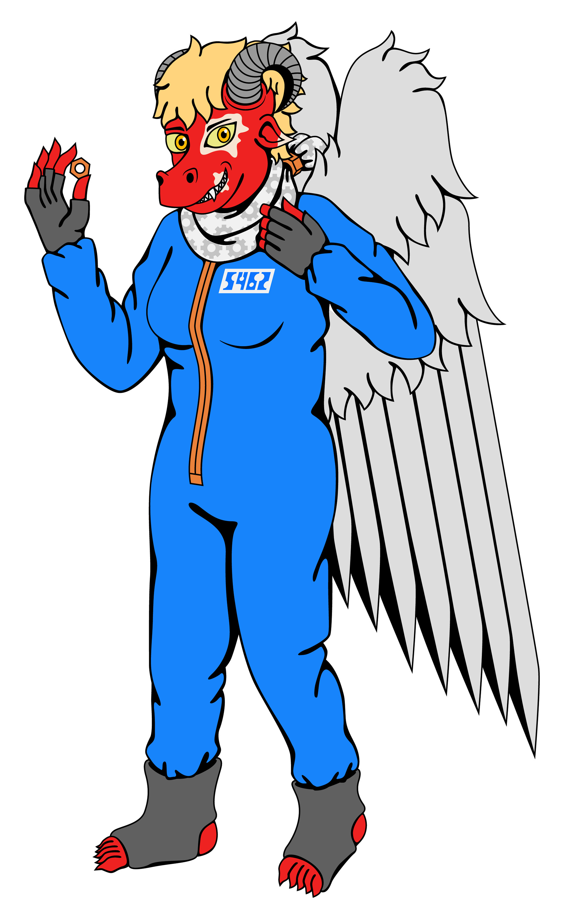
Verin 61 - v.2.4
V.2.6 was a major leap forward, featuring many different changes.
Firstly, and perhaps most noticeably, is the removal of her wings. My creative writing regarding Verin has changed multiple times and the wing removal was part of a realisation that her being able to fly was an unnecessary part of her character.
Next, the hex nut securing her scarf and the ends of said scarf were increased in size and the tips of the ends were changed to points. This latter change was because the ends should be corners of a rectangle and the previous design did not reflect this.
Many design aspects of her head were overhauled, for example, the shape of her snout was improved with the overbite removed and jaw moved back and given clearer definition. Her ear was also adjusted to account for perspective since it should be flatter to her head similar to how a human ear usually is. Her horns remained broadly the same, but were tweaked slightly and positioned further forward on her head. In previous drawings, her hair was styled as a wide and floppy mohawk flanked by her horns. This was updated to an upright mohawk that looked more styled than messy and unkempt. An additional viitiligo mark was added over her nostrils. The reason for this was that I tend to draw the left side of a character's face more often, so the vitiligo markings on Verins' face are weighted to her left side. This new mark's position was chosen so that it will also be visible from her right side.
Finally in this version is the update to the Verin Slab glyphs on her coveralls. With the creation of the 'Square' variant of the typeface, the tag was altered to accomodate the square numbers. It was decided that these would look best flanking her coverall's zip instead of the more convential nametag positioning from before.
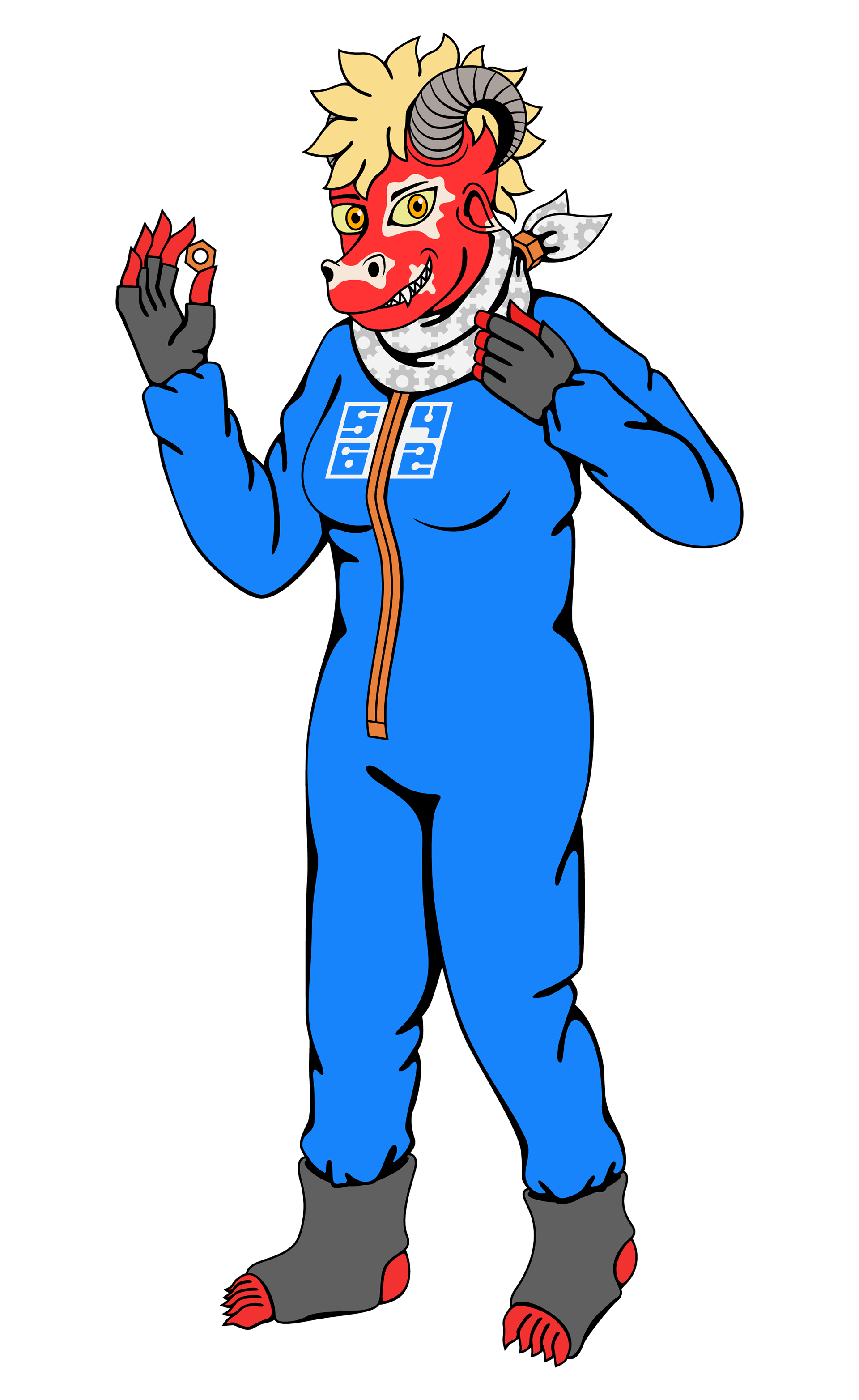
Verin 61 - v.2.6
V.3.4 is the final version (as of writing) and features mostly subtler, but no less important, improvements.
First was the improvement in the shape of her vitiligo markings (especially the one around her left eye), bringing greater order and symmetry to their form.
Minor edits were made to her scarf, including adjusting the ends so that they point backwards more than to the side. The design of the scarf has, for the most part, reached perfection by this point.
A problem with my art style is showing body shape (for example, the breast area) with minimal lines and no gradients. Verin's boilersuit/coveralls are baggy, so her body shape should be masked somewhat, as reflected in this new version. The bottom of the zip was also altered to be better intergrated into her clothing and not look 'tacked on'.
Finally, brass rings were added around her wrists to better represented the bunching of her boilersuit/coveralls at these points. Brass rings were also added around her ankles to more effectively show how they are secure to her without the use of laces.
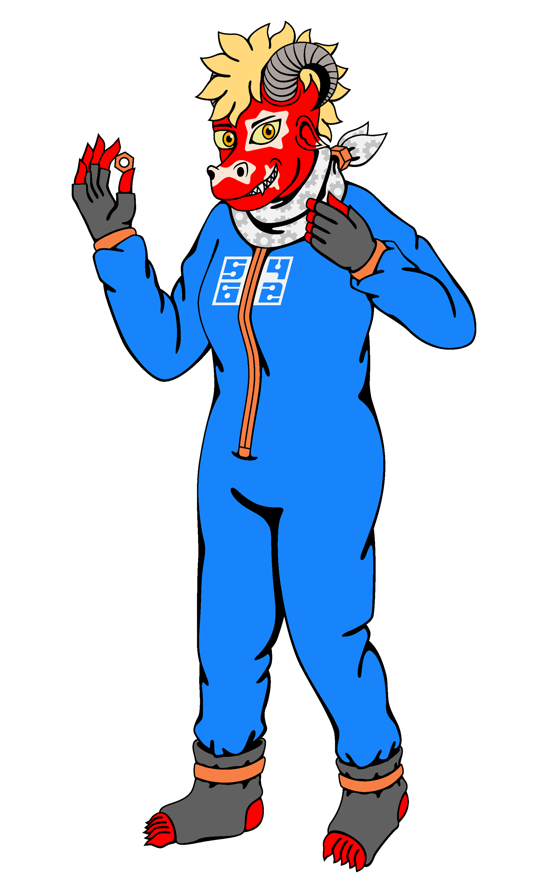
Verin 61 - v.3.4
Although I have occasionally experimented with more representational styles of background, I tend to lean towards combining my abstract styles with my character designs. In the case of Verin 61 v.3.4, I chose a background that fitted in with the metal fixing theme set by the hex nut she is holding, the pattern on her scarf and the hex nut securing it. Attention is also drawn to the hex nut in her hand through the different colour of the large background hex nut and an additional smaller one, both centred on the foreground hex nut.
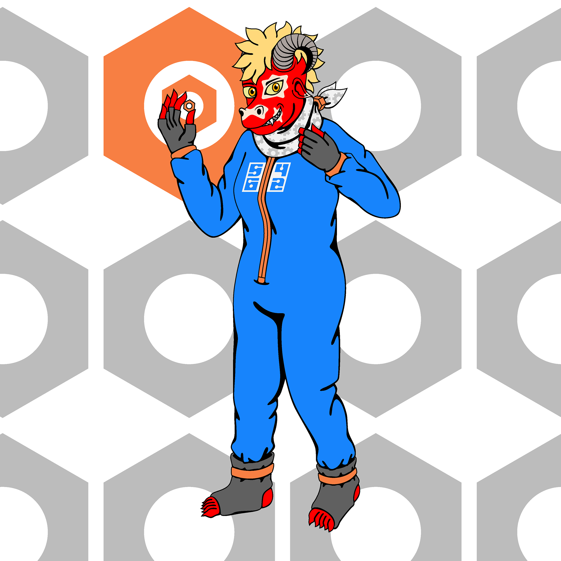
Verin 61 - v.2.6 with background
As well as the hex nut background, other designs were created throughout the development of 'Verin 61'. For example, this is the background used for v.1.1 - v.1.93. While largely intended to be non-representational, the warm colour palette chosen complements Verin's red skin. Adding to this was the colour change of the line work and shading to a dark red, which was not reflected in the above character designs because the default colour is black and it wanted to isolate the drawings from their backgrounds.

Verin 61 - v.1.1 - v1.93 background
The second background, used for v.1.97, uses drafts from designs in the upcoming series 3 of my 'Warped Space' project, albeit in different colours because the latter project exclusively uses a colour palette of white, black and red.
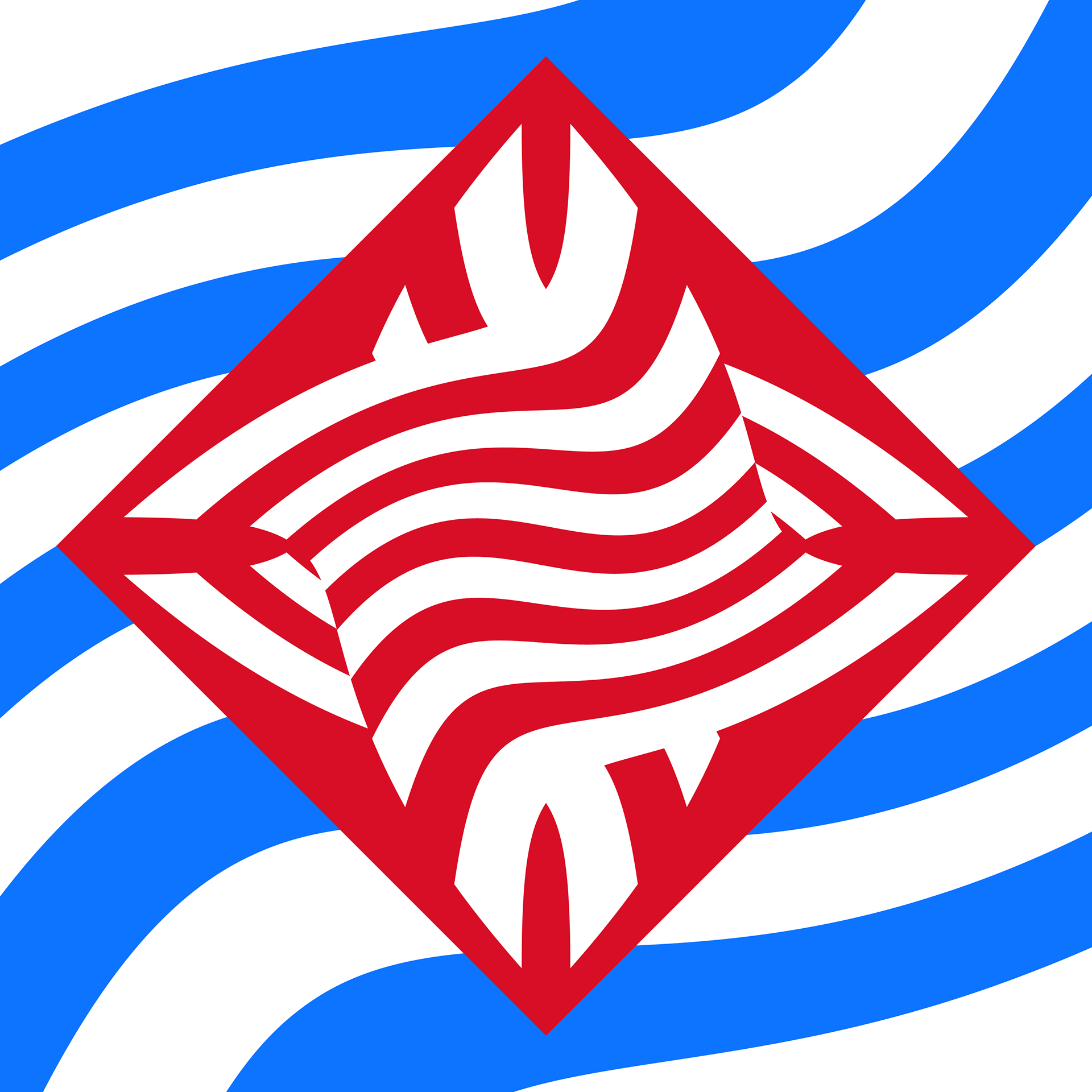
Verin 61 - v.1.97 background
Finally, this is the background used for v.2.2 - v.3.4. Visible is the recoloured hex nut and smaller nut that highlight the one that Verin holds. The background progression highlights an improvement in their implemention. For example, while the colour palette of the first background attempted to complement Verin's skintone, the majority of the colours in her design contrasted with it, such as the blue of her coveralls.This was addressed in the second background, whose use of fewer colour shades, instead using a vibrant colour palette of red, blue and white. Sometimes, I am satisfied with that level of non-representational art for the background, but in this case, I wanted to tie background and foreground together a little more closely.

Verin 61 - v.2.2 - v2.6 background
In summary, I see my art, and especially my character designs, as never truly 'finished', a perspective that vector art indulgences.