Verin Slab is a stylised Slab Serif typeface evoking machinery and the future. It was borne from a perfectionist need for perfect alignment following on from my Agla Sans font, resulting in each letter being the same sized square and using a restricted number of sized and shaped apertures.
Its purpose is as a display typeface for album artwork, posters or other similar compositions in which only a few words are presented in this font. This is because it is abstract and monospaced, with wide, square glyphs and no lowercase. In addition to the letters, there are numbers but no punctuation.
The following six images show the grid I used to create the glyphs in, which has been carried over from Agla Sans, hence the space for descenders. In its original iteration, 'Regular', many glyphs were square, such as 'E' in the first image. Also displayed in this image is one each of the permitted sizes for circle and rectangle apertures. Overall, there were 3 main sizes for circle diametres and 2 for rectangle widths. However several more circle diametres were later added but were primarily used for corner cut outs rather than as apertures.
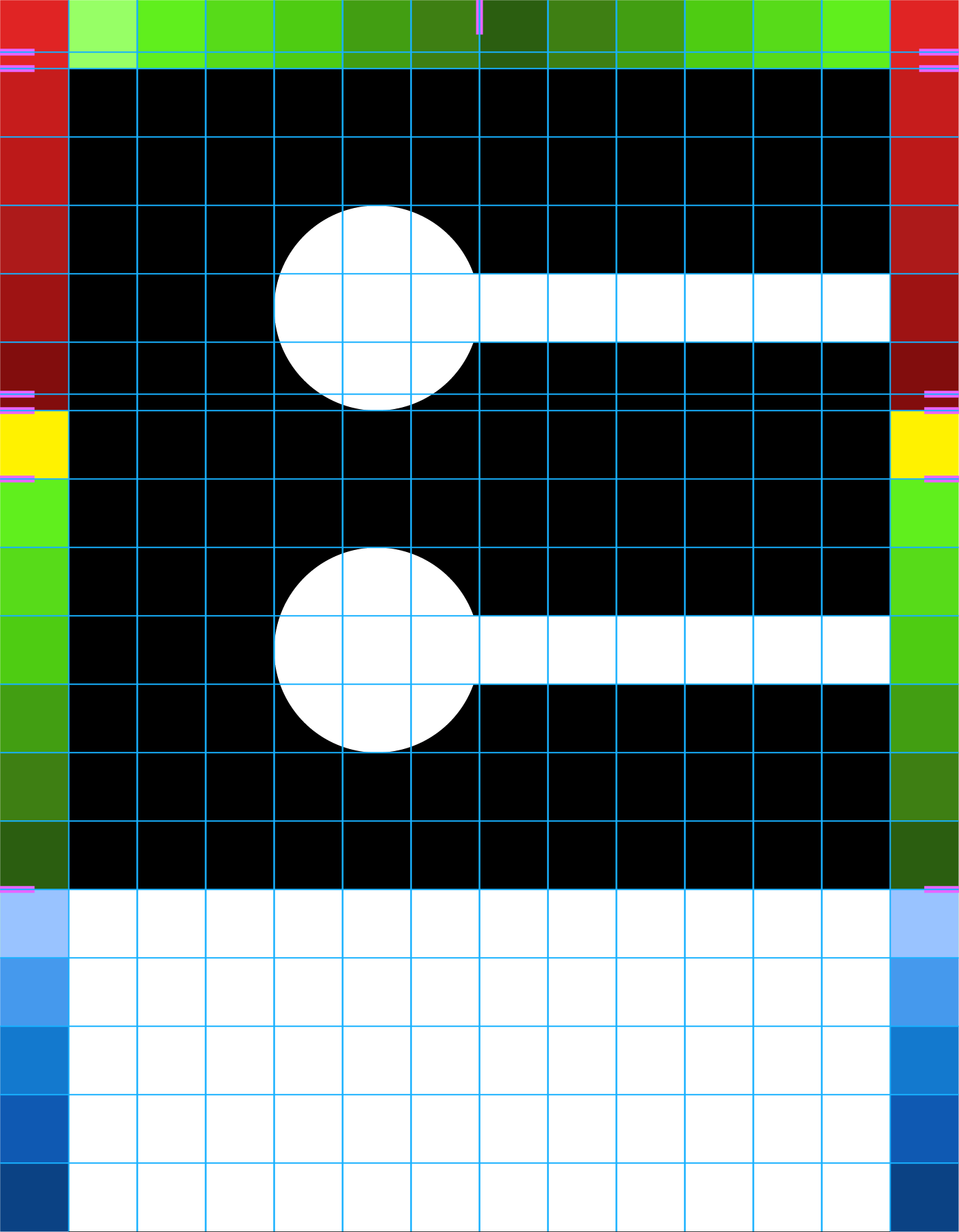
'E'
'O' was the framework for several of the curve-based glyphs. So that it appeared to be the same height as the flat-topped glyphs, it is ever-so-slightly taller.
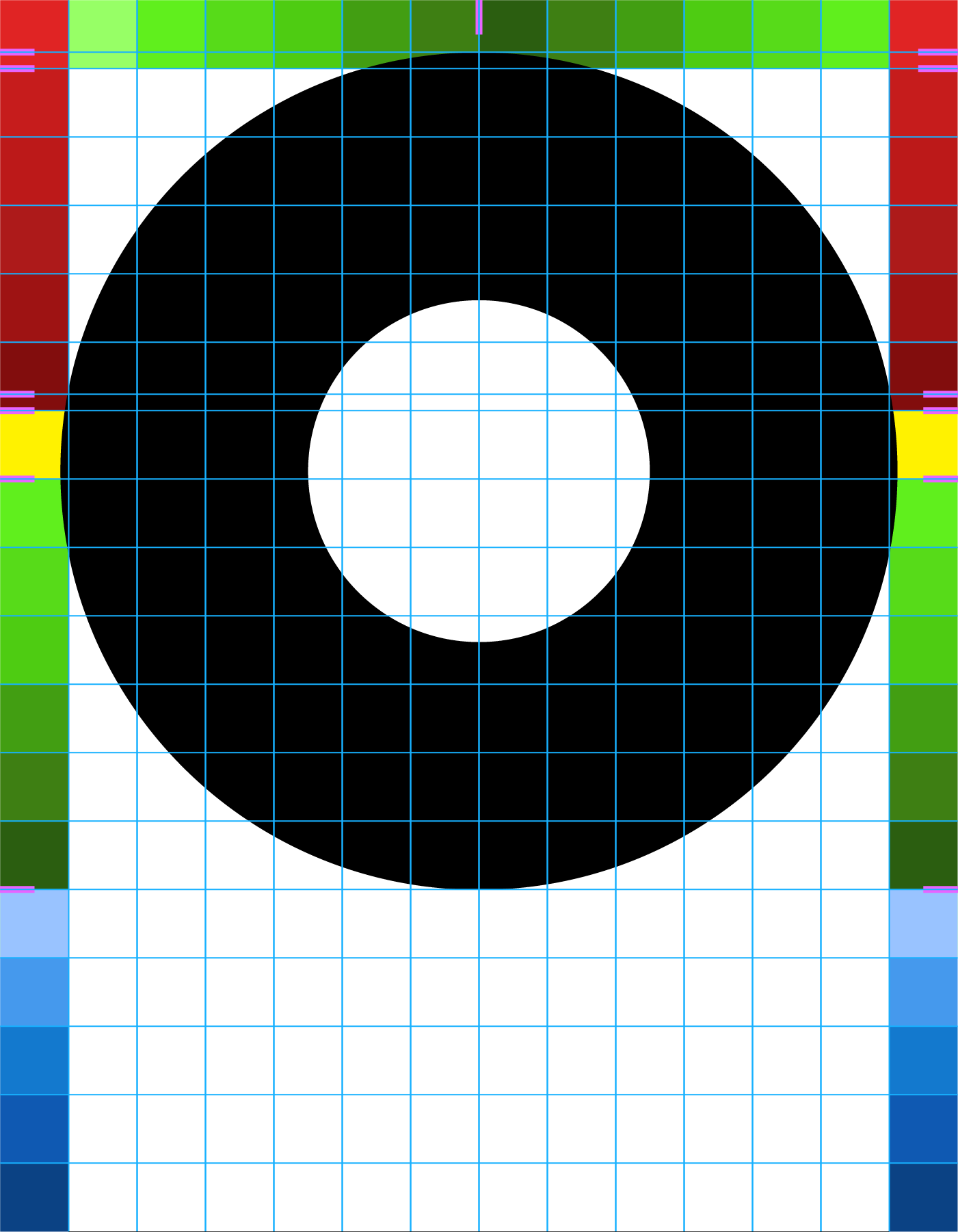
'O'
'T' is an example of a glyph that is the same width and height as the square glyphs at its widest points, but does not fill the available space.
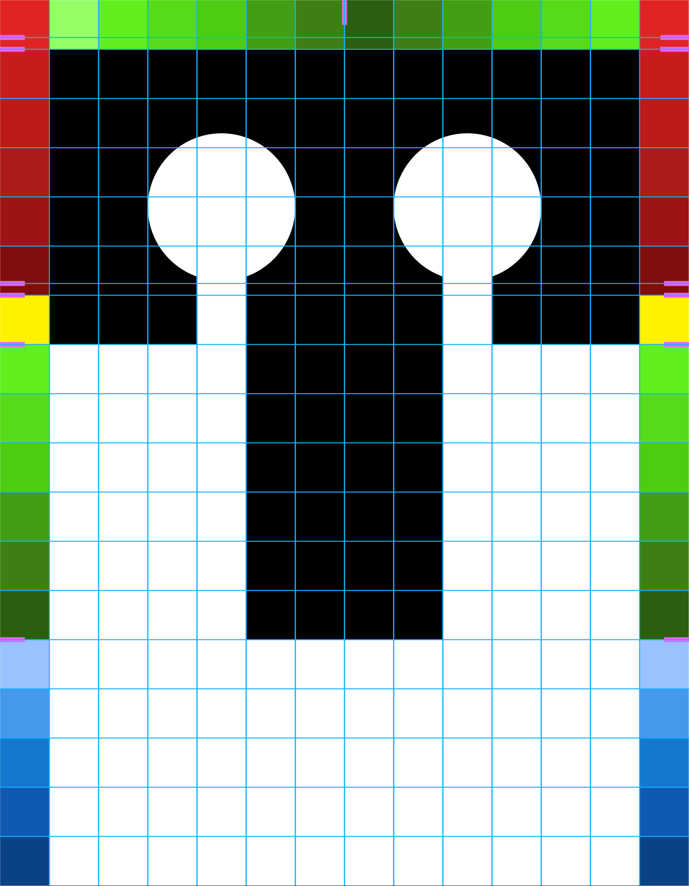
'T'
'7', like all the numbers in the 'Regular' variant of Verin Slab, is half the width of a letter, which results in more conventional proportions. Two circular cut-outs are carefully placed to create a diagonal line, which were avoided as much as possible, but were deemed acceptable for '7'.
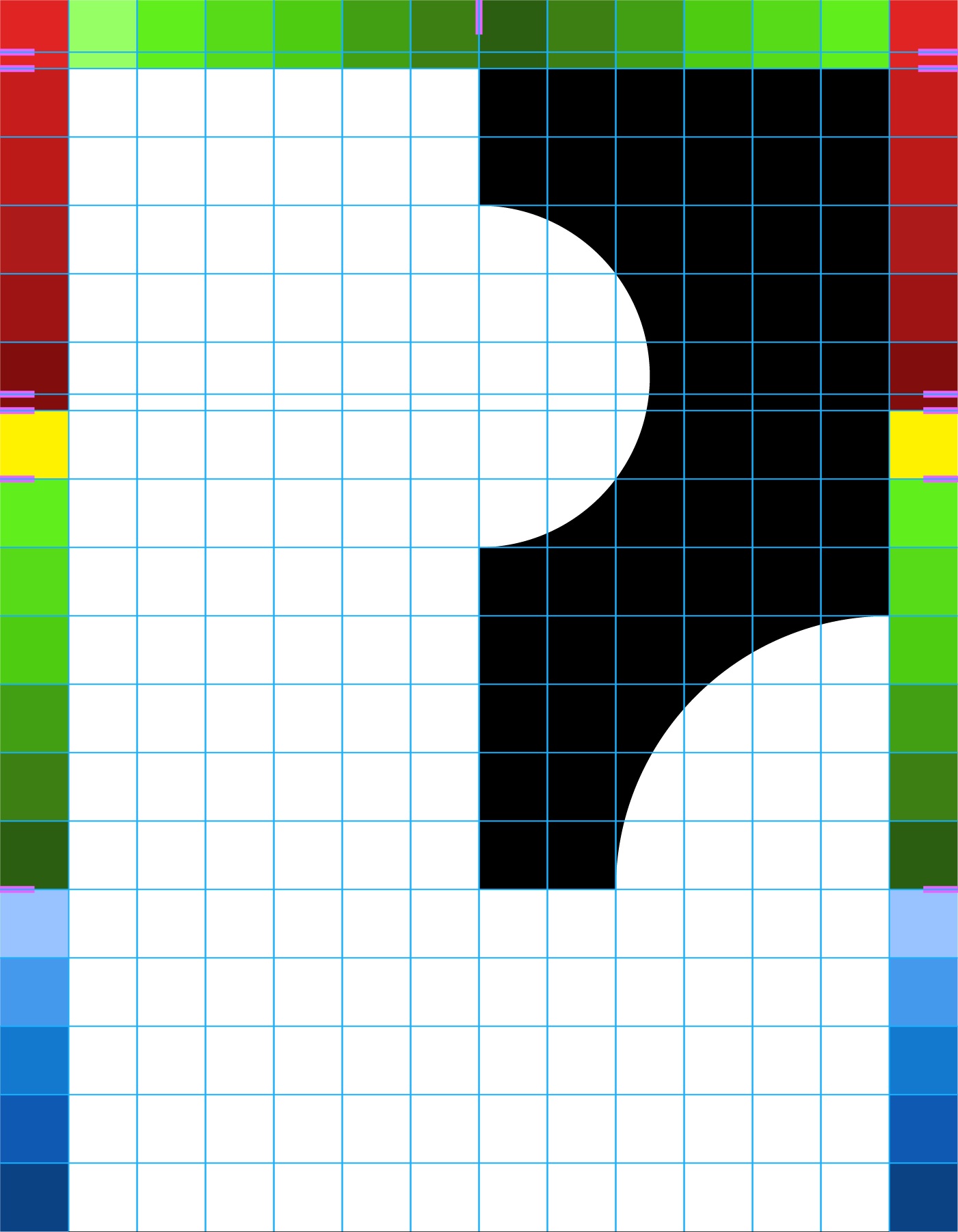
'7'
A-Z and 0-9 fit nicely into a 6x6 grid, though the numbers being half-width does distract somewhat. A case could be made for that being ideal because it identifies which are numbers and which are letters. The restrictions placed on aperture size worked well in create a strong sense of cohesion and identifies each glyph as part of the same font, even with the more unique examples, such as 'B' and 'L'. Increasing this theme was the decision for multiple glyphs to be identical except for rotation and for others to be based on each other with only parts differing.
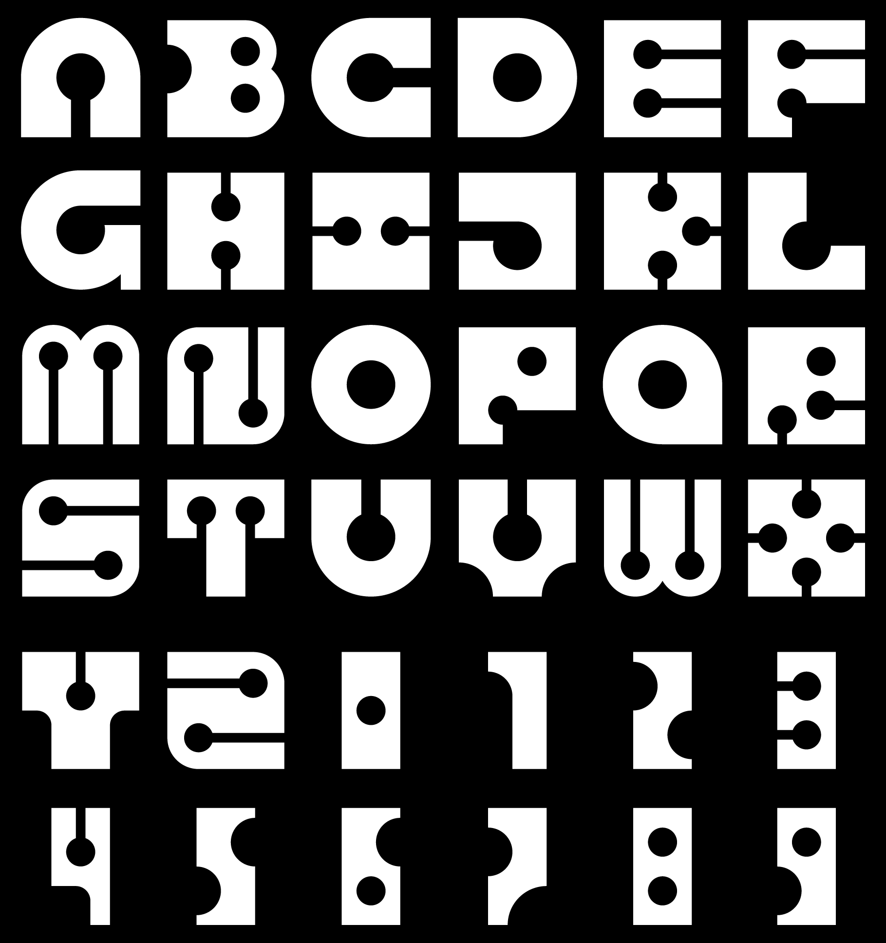
Verin Slab 'Regular' - alphabet and numbers
As with Agla Sans, I created an A4 poster design to showcase the typeface and emphasise its core attributes. In Verin Slab's case, this involved neat rows of the alphabet and numbers. These were separated by larger lettering spelling out Verin Slab, which was grouped into three rows of three glyphs. However, the numbers took up less space and therefore disrupted the uniform number of glyphs per row found elsewhere. This led to the creation of an alternate font in the same typeface family designed in an effort to fix this perceived inconsistency.
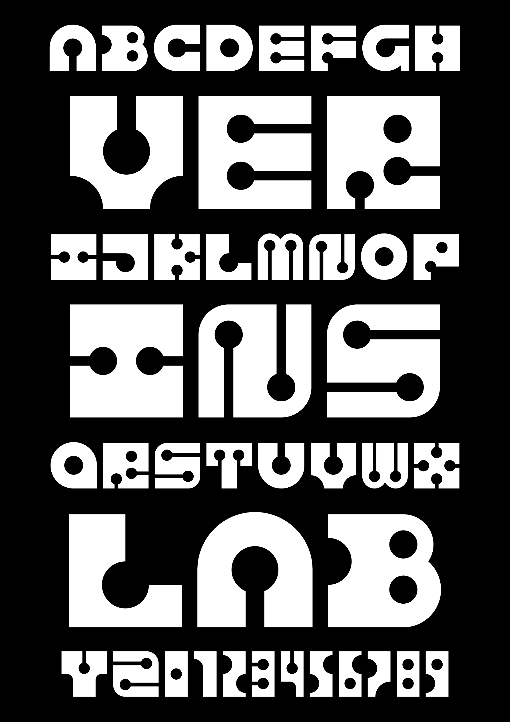
A4 poster design showcasing the 'Regular' variant of the typeface
Verin Slab 'Square' seeks to address the inconsistency caused by making numbers half the width of letters and curve-topped glyphs slightly taller than flat-topped ones. While the latter is done to combat optical illusion issues, it means that if one wanted to fill a quarter of a square space with a glyph, for example, those that are curve-topped will not fit. Additionally, this typeface was originally intended to be square with a high level of consistency and cohesion.
To fix this, curved tops were removed and numbers changed to be the same width as letters, resulting in every glyph now being exactly square. Circular cut-outs were used to greater effect to create a similar effect to an outward curve while maintaining the square proportions.
Additionally, 'N', 'S' and 'Z', were varied by rotation or mirroring, but with the need to create new designs for '2' and '5', the decision was made to make each glyph more unique from each other to avoid potential confusion.
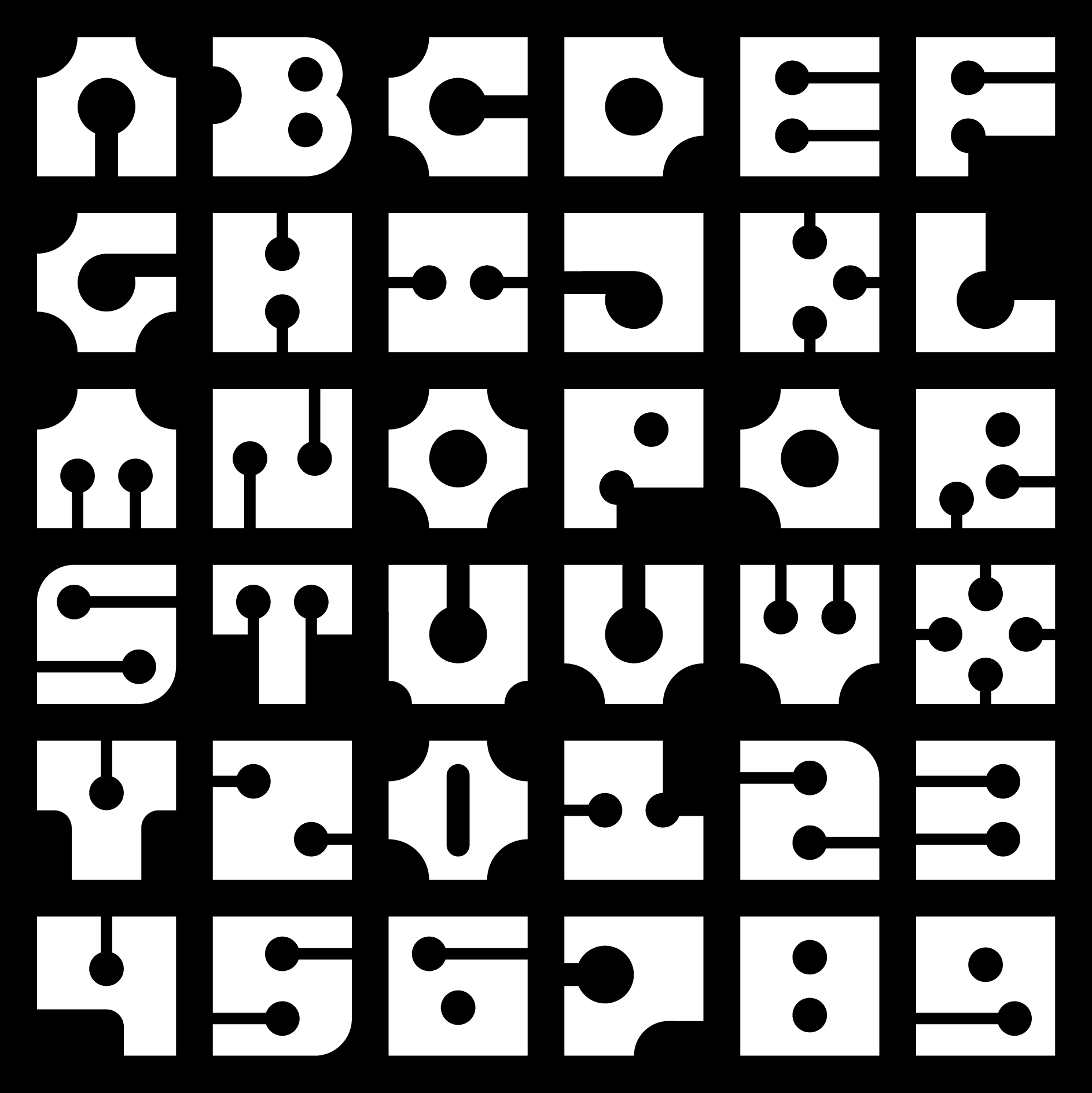
Verin Slab 'Square' - alphabet and numbers
Although my primary styles of digital art are focused around abstract minimalism, character design is also explored, and combining the two has been frequently experimented with, especially regarding backgrounds for the characters. In this case, the numbers on the coveralls of the typeface's namesake, Verin, were set in the 'Regular' variant of Verin Slab.
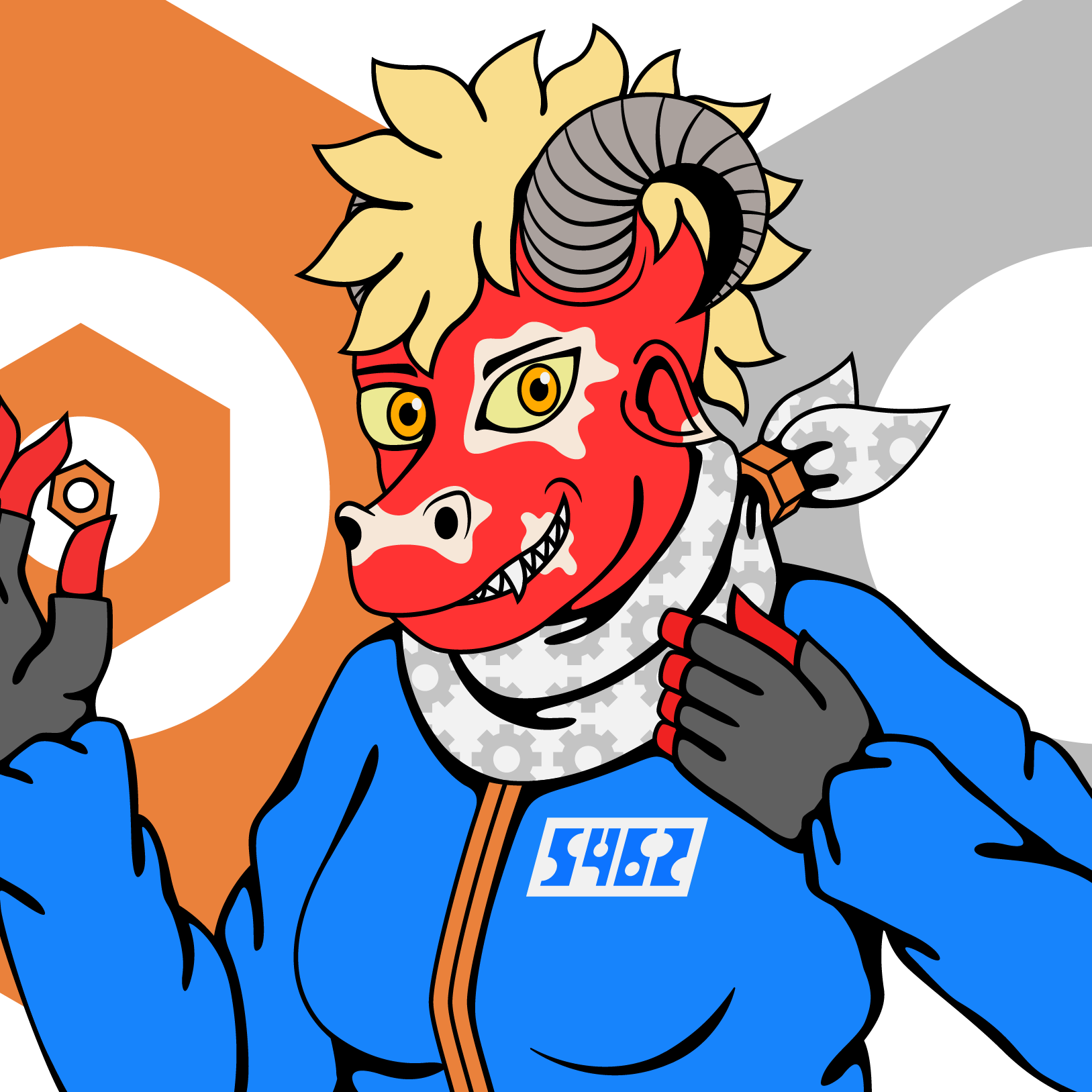
Verin Slab 'Regular' in use on a drawing of its namesake
With the creation of the 'Square' variant of Verin Slab, the Verin design was altered to include it. Since the numbers are now square, the layout was changed so that the numbers were placed on either side of the coverall's zip.
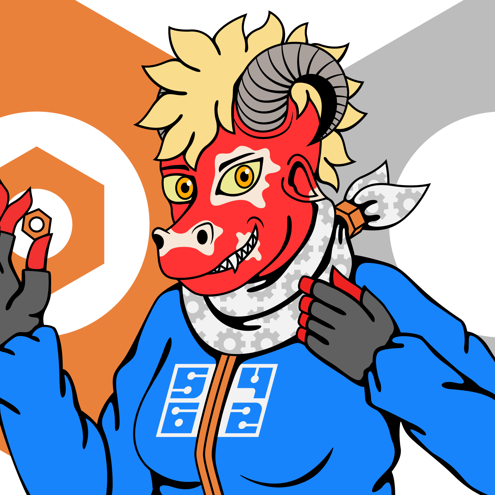
Verin Slab 'Square' in use on a drawing of its namesake